Remove Friction? No. Help Make Progress
There’s some popular advice you’ll hear about making a landing page: have a hero at the top, have testimonials and social proof, show features and benefits.
And above all, you better reduce friction. Hold on a bit.
People don’t mostly leave your site because there’s friction. A single product can’t be that good that you can remove all the friction for all the people. (More on this “for all the people” below.)
People leave your site because it’s not the right time.
Maybe they’re earlier in the process. Or maybe they’ve got hesitations, anxieties. I’d help them out with those situations instead of optimizing your site to be friction-free.
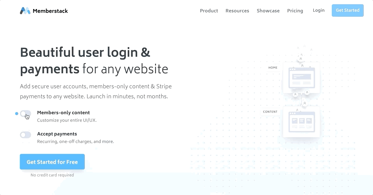
Friction-Free Example
I discovered Memberstack.io from fellow landing page optimizer Olly who shared a video saying it was one of the best landing page he’s seen in a while.
It’s a good landing page.
There are interactive widgets previewing the impact of what this product will do to your business. That’s the way to go if you’ve got the money. Very smooth.
They’ve also got some numbers which may or may not be credible. And they’ve got a wall of testimonials.
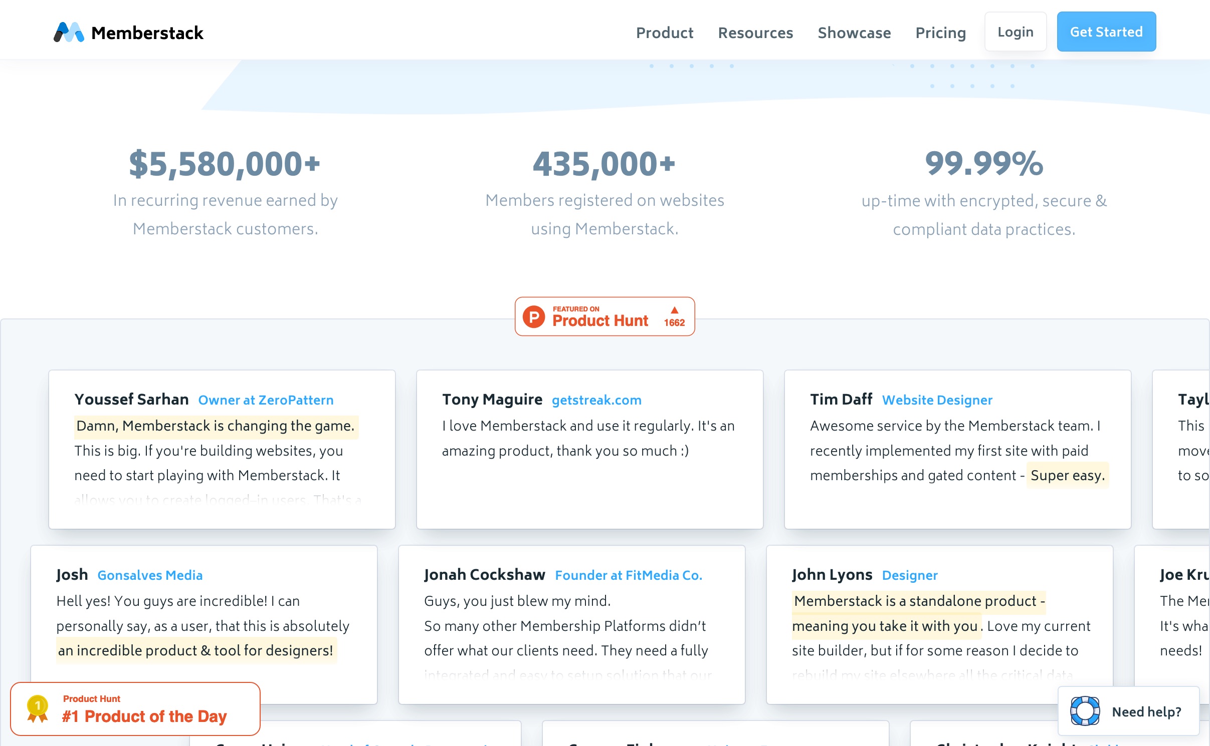
To increase trust, “#1 Produce of the Day on Product Hunt”. Sure.
More custom interactive widgets further down.
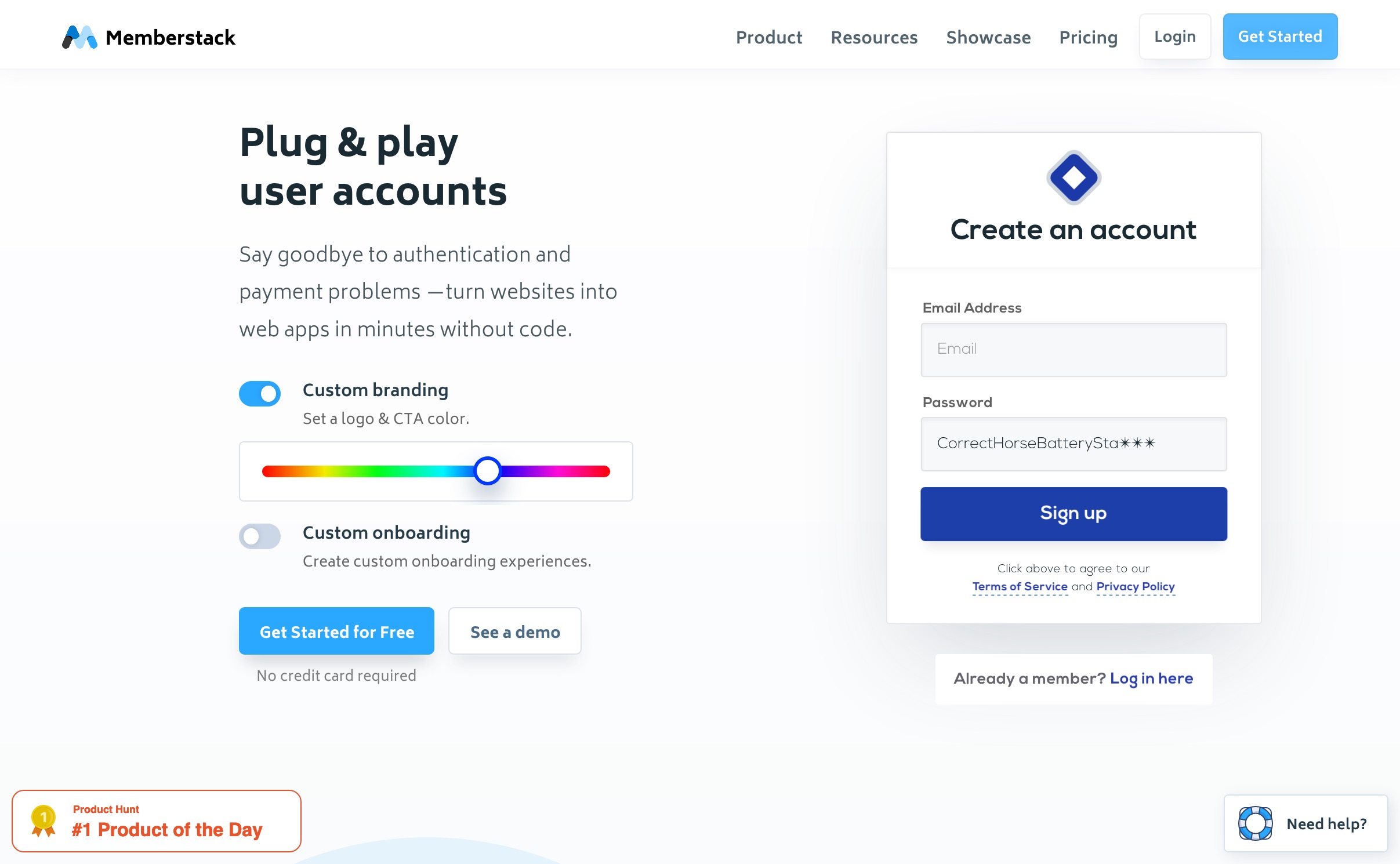
I liked how surprised I felt when seeing that interactive widget. So clever at re-assuring visitor anxieties (more on anxieties below).
The Error in Friction Removers
Olly mentions the importance of friction removers like the interactive widgets, and this “No credit card required” below the calls to action.
That caught my attention, because there’s more to friction than a thing to have removed.
What’s friction translated into visitor feelings? Here it’s probably anxieties and hesitations.
Anxieties, Hesitations, Struggles and Lost Opportunities
- When a visitor comes to a site, they’ve got a job they want to get done.
- The thing that started them on that journey was that they experienced some struggle, some moment when they said “enough is enough”. No hard struggle, no momentum for a yes.
- The ⚬→ Struggle is one of the Forces of Progress, the forces at play in the mind of the visitor and she weighs the choices and the trade-offs.
- There’s also the →⚬ Attraction force, pulling them toward a “yes, this will do the job”.
- There’s also the ←⚬ Anxieties force, pushing them back toward “not this”. Hesitations, any anxieties like pricing (not always the main anxiety), but also things like “will I have to learn something new?” and “how will this fit in my current setup?”
- And then there’s the ⚬← Habits force, the strongest one, the “I’ll just” statements in the mind of the visitor, pulling back toward “not now.”
Why does this matter?
As I mentioned above:
A single product can’t be that good that you can remove all the friction for all the people.
People leave your site because it’s not the right time.
Using the lens of the Forces of Progress, we realize that although you can’t remove friction for all the people, we can understand that the product caters to just a few specific jobs-to-be-done.
When making a landing page, it’s not about targeting certain people, it’s about targetting certain struggles.
People want to make progress on those specific struggles, and when you spot a hole in your landing page, you’ve got new improvement opportunities.
Run-through Using A Smaller Struggle
I’m not sure what struggle the full product solves, but I can think of a smaller struggle I’ve experienced myself, for which this platform might be interesting.
“When” Statement:
When I’m realizing I’m putting a lot of effort into making content (that’s the struggle initiating the search), I want to find a way to put some of my content behind a subscription so I can continue making more of this content supported by my audience. (the job-to-be-done, the aspiration)
When going down the page, I’m experiencing these forces.
- →⚬ Attraction: Nice, a way for me to put some content behind a paywall.
- →⚬ Attraction: Nice, recurring payments, people seem to use this and they seem to like it.
- ←⚬ Anxiety: But how do I secure my content? Do I have to host it behind their thing?
Here, the page creates a big anxiety for the situation I’m in. I’ve already got ideas about how I’ll host this content. I’ve already got a site. The page tells me I can install a subscription form on any website, but where will my paid content be hosted?
I know I don’t need to change my website too much to put a subscription form, but I’m pretty sure my website can’t host paid-for content without some heavy lifting.
Big anxiety.
The “No credit card required” does not provide any re-assurance for my situation. It’s a cliché that doesn’t help me make any progress. That note, which was supposed to be a friction remover, actually contributes to my hesitations.
There’s no way I’m trying the product without getting an answer for this question.
I scroll a bit. I don’t see anything re-assuring regarding this problem. I leave.
- ⚬← Habits: I’ll just build an app in Rails with the Bullet Train starter kit (which has Stripe integration) to host my content and charge my visitors.
Conclusion: the landing page has a hole! Maybe your site has no friction, but if there’s a hole, people will slide right into it and leave.
The Opportunity
The job-to-be-done is “so I can continue making more of this content supported by my audience”.
Maybe the landing page can help people with that ambition.
- Right below the “Give Started for Free” call to action, maybe the page could have a link to “Learn the nitty-grity about hosting your paid content”. Keep the note about “No Credit Card Required”, but add that new secondary link. This is for people who were never ready to put a subscription form on their site just yet, but their first steps are about getting ready for the eventual switch.
- Maybe add a section further down to show how the hosting is done. That’s for people who scrolled right away, blowing right by that link below the call to action. Like those interactive widgets the page already has, this new section will about creating re-assurance and catching those that aren’t ready for a full-blown sign-up just yet.
- Maybe offer a free mini-ebook on how to create content that’s worth putting behind a pay-wall. This will be a mini struggle-solver which will help spread the word about Memberstack to others. This would be a great thing to put at the bottom of the landing page for those people who were saying “not now” and about to leave anyway.
Removing friction, as an absolute, is a bit of a distraction. It’s the wrong lens, the wrong thing to optimize for. Instead, I recommend the lens of making sure your landing page helps your visitor make progress on the struggle they’re experiencing.
Maybe you won’t squeeze every last drop from your visitors (how rude), but by focusing on helping your visitors make progress, you’ll create more trust.
Stay Sharp!
—
Pascal Laliberté
@pascallaliberte