When Your Software Proposes a Different Process
Is your software’s marketing page good?
Here we’re fans of marketing pages (landing pages) with very specific attributes:
- Your marketing page isn’t there to convince. It’s meant to tell the visitor “you’re in the right spot”, “I understand your pain”.
- Your marketing page is there to help people make progress on a struggle.
- Your marketing page can be long, just make sure each section catches the curiosity the previous section created. Those who scroll all the way down are like people who stuck through the long version of your sales conversation. They’re ready for more details.
- Your marketing page should recognize that you’re mostly in competition with people doing it themselves.
When it comes to selling software, there’s one technique that works really well for your marketing page. Show your visitor there’s a better way. Instead of/You’ll have, Before and After, Here’s a better scenario… those are all great ways to communicate you understand the pain and you got your visitors covered.
Example: Moneto Starts Off Right, But…
Moneto’s marketing page uses that “there’s a better way” approach to great effect. But as we’ll see, because it proposes a different process, there’s a hugely important part missing from their marketing page.
It starts off with an enticing before and after.
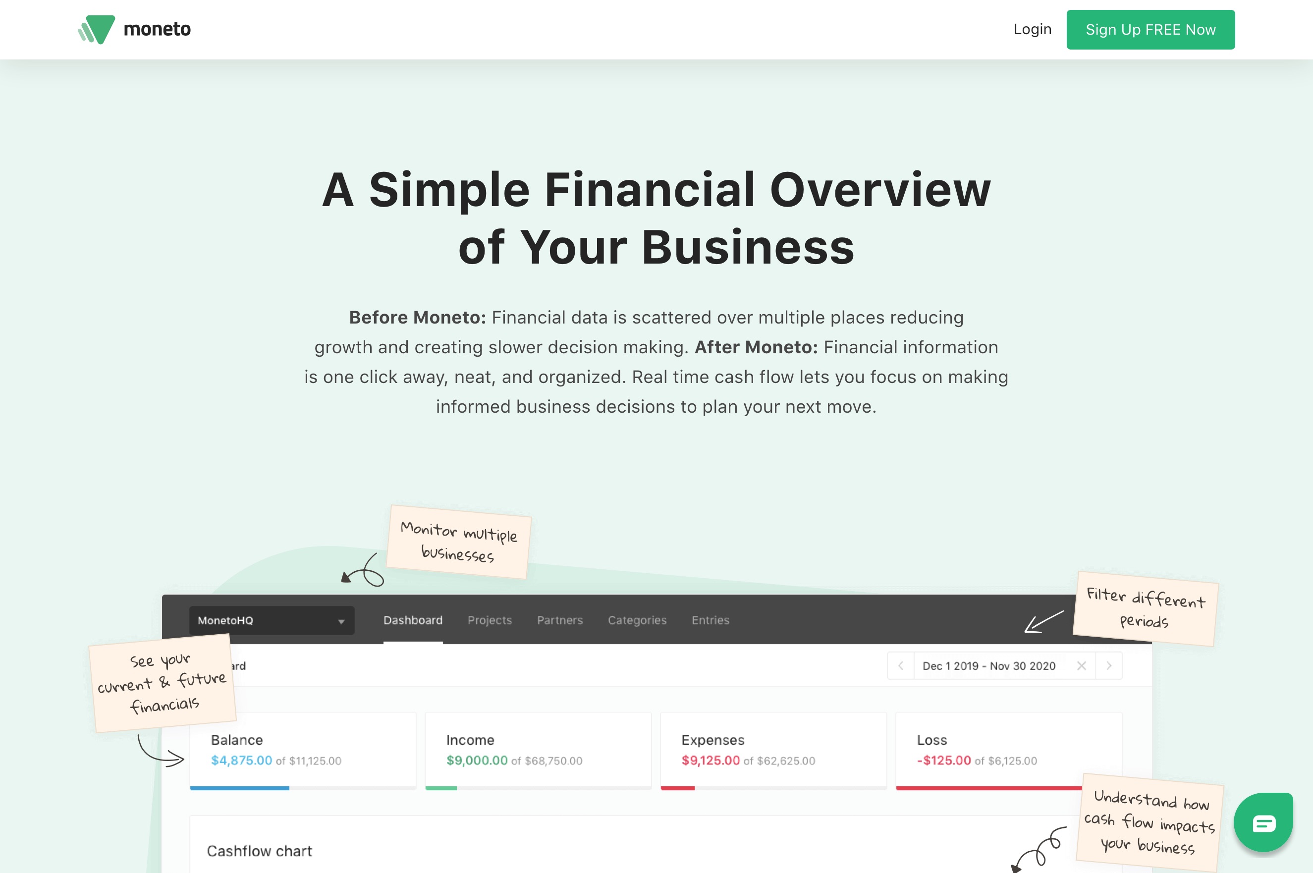
The visitor reacts with “I do have my financial data all over the place. Tell me more (who cares about the other tools on the market, you got my attention)” and scrolls.
The page then shows off how Moneto delivers on the promise: everything in one place.
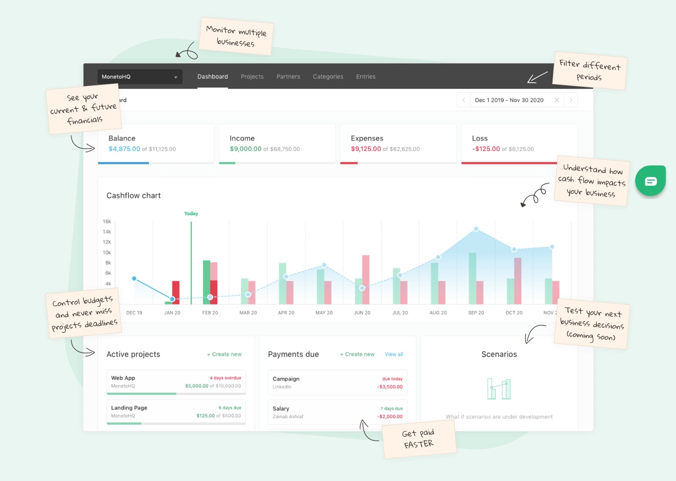
The visitor reacts: “Hrmm, yeah, I get it, everything in one place. I was never able to see a birds-eye view on my finances with my current mish-mash of spreadsheets and crazyness…” Scroll for more.
And then, a pitch to sign up.
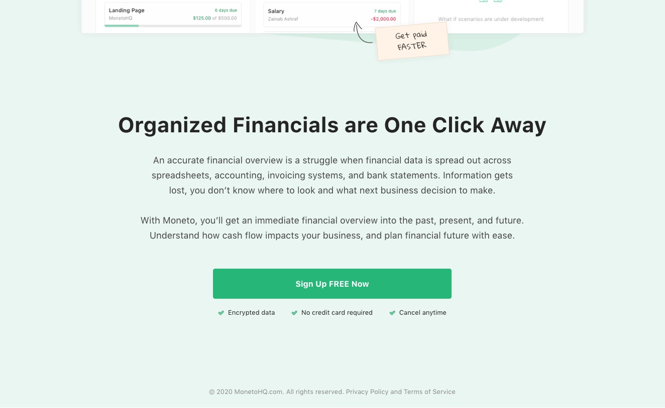
The visitor reacts: “Ugh… that’s it?”
“I Have so Many Questions Unanswered”
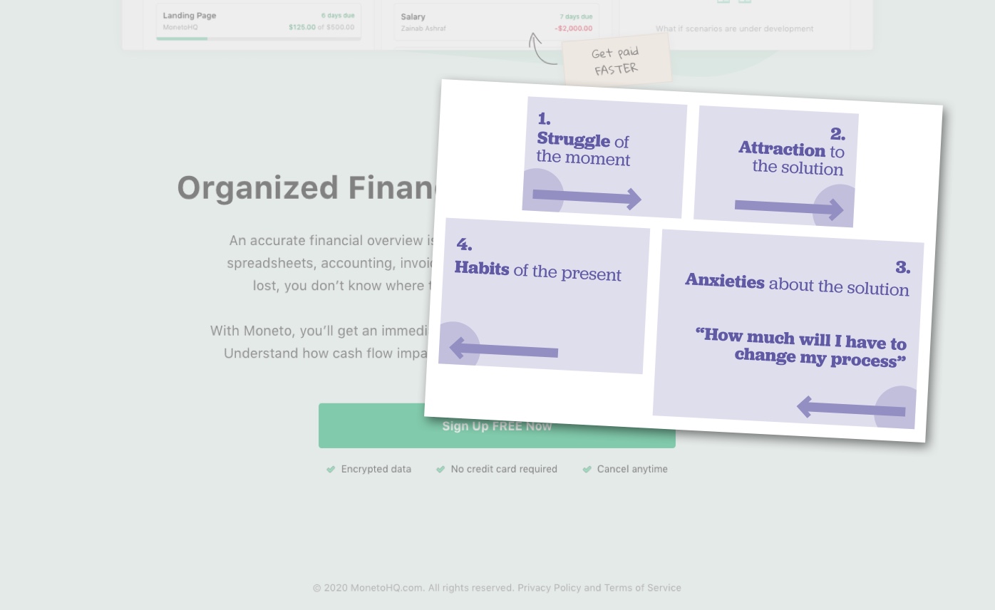
When it comes to selling, you have to clear the forces at play in the mind of the buyer.
The ⚬→ Struggle propels to start the search. The →⚬ Attraction pulls in toward the product. ←⚬ Anxieties put the brakes on the momentum. The ⚬← Habits of the present (however they’re currently addressing the struggle) pulls hard to come back to safety.
Want a sale? Make sure the top two forces are stronger than the bottom two forces. And the ⚬← Habits force is usually the strongest, like a strong a gravity well pulling back toward non-consumption.

So on Moneto’s page, when the visitor gets to the bottom of the page, the bottom forces swell up because of the following anxieties (and none of them are about price!):
- ←⚬ Will this have everything that my current spreadsheet-based process allows me to do?
- ←⚬ Will I have to enter everything manually? Right now I get my financial information by exporting from different systems.
- ←⚬ How much will I have to change my process?
“Show Me How I’ll Have to Change My Process”
The best thing Moneto could do to improve their marketing page is to address the anxiety around process change.
Those who bothered to scroll all the way down the page are experiencing the struggle, they’re attracted by the proposition and they’re considering switching to the product. They’re interested! They’re just anxious about what they’ll need to do to change process.
Price isn’t the main cost of switching, process change is the biggest cost.
So sure, have an invitation to try it out at that particular spot in the page, but just below that invitation, continue with more for people who still have questions (and add another sign up button after you’ve done that).
Some of the ways Moneto could use this part of the page to address that anxiety:
- Have an FAQ about what people who switch to Moneto will have to consider. Easy to write, effective in communicating you got those anxieties covered.
- Better, have illustrations of the before and after. Spreadsheets on the left, how you do each operation in Moneto on the right. Hold their hand through the process! Cover every angle starting from the most frequent type of action or highest likelihood of concern.
- Run a video tour. Not as great as illustrations (because it’s not as scannable by scrolling), but it still works.
- Use trust-building words like “We know you’ll need to switch away from a system that you’ve been using for a while. We’ve got you covered.”
- Tell them what the product can and can’t do, up front, so the visitor doesn’t have to sign up to get the bad news on their own time. Show where the product is heading. Maybe they can use only one part of the product that will help a ton, and get on board knowing you’ll cover all the other angles in future updates.
You’d be showing these at the bottom of the marketing page. This is only there to help visitors through their hesitations, their doubts, and their anxieties. This isn’t about convincing them to buy your software, but it’s to show an abundance of care for their current concerns and a commitment to helping them get to that “better way” you’ve been promising at the top.
Whether your software is simple or full-featured, if it proposes a change in the buyer’s process, it pays to be up front about how the process will be different. It’ll ease anxieties, build trust, and in so doing, bank in on the attraction. Boom. Sold.
Stay Sharp!
—
Pascal Laliberté
@pascallaliberte