Yeah but Apple and Intercom Design Their Pages Using Features and Benefits
I’ve been taking a hard stance against the Features and Benefits style of landing page design, which:
- Starts by describing the product.
- Shows a compelling use case for using it at the top, with a catchy heading.
- Then describes its features and its benefits.
Instead, I’ve been promoting a Struggle-First layout style for your landing page, which:
- Starts by describing to the visitor the struggle they’re likely facing.
- Has visitor react by saying “I feel seen!”.
- Then uses more words to make them feel understood.
- Only after having established that you truly understand the struggle does the page make the case for your service or product.
You’re probably asking…
But how come places like Apple and Intercom use a Features and Benefits style of landing page, and it works great for them! I should be able to do the same.
Indeed, they do use a Features and Benefits style of landing page design.
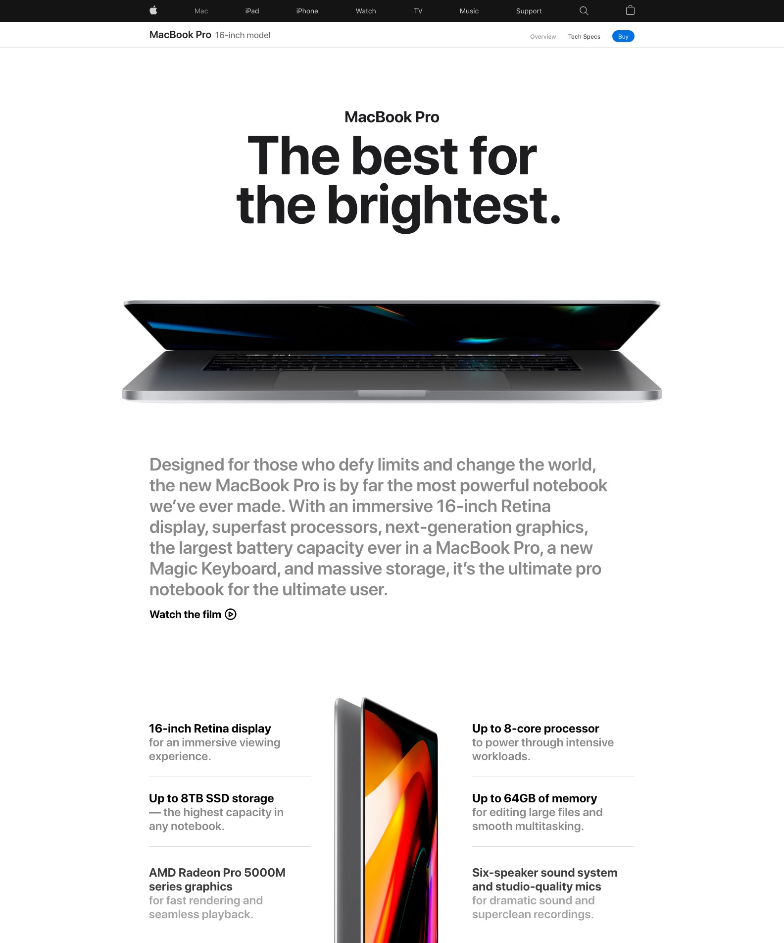
Why They Can Pull Off a Features and Benefits Style
Both Apple and Intercom are confident in their understanding of the job-to-be-done of their product:
- Both understand what buyers are saying no to, the ⚬→ struggle they want to move away from (what they’re “firing”);
- Both understand what →⚬ pulls buyers into deciding to say yes to the product;
- Both understand what creates ←⚬ anxiety into the mind of the buyer, putting brakes on the purchase momentum;
- Both understand what the product is really in competition with (it’s not other similar products, but rather, the mish-mash of current habits they’re currently using, ⚬← what they will default to);
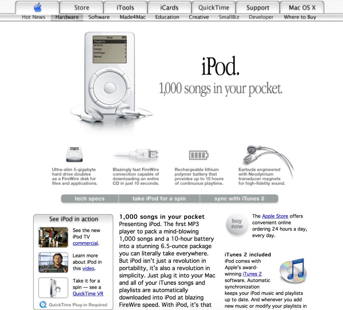
When Apple launched its iPod with the phrase “1,000 songs in your pocket”, it very well knew the struggle, the attraction, the anxieties and the competition surrounding the iPod.
It sold iPods to people who never owned an MP3 player before. That slogan, in itself, contained both the struggle and the solution: “I couldn’t have all my music with me before, but now I can.”
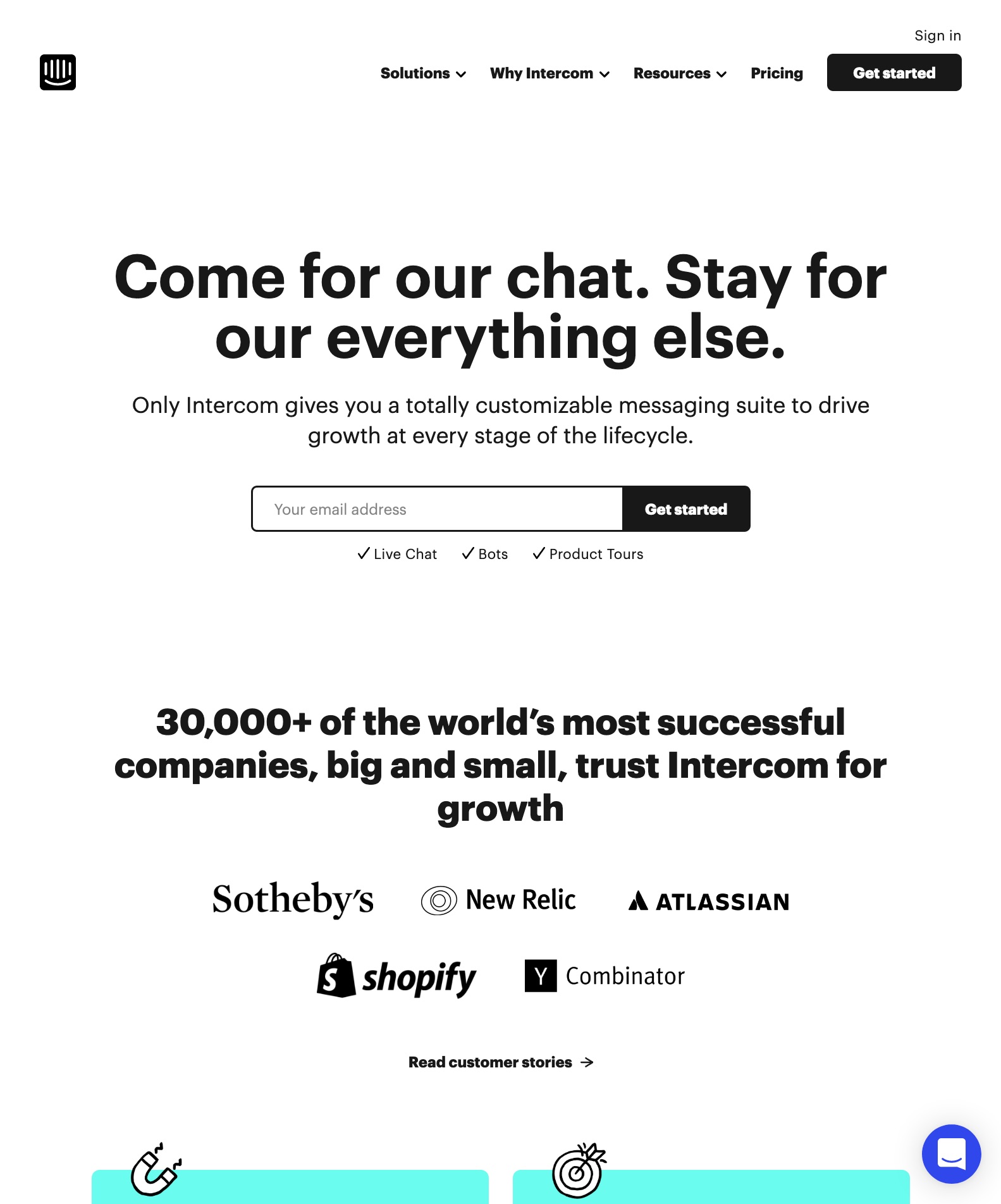
But what about Intercom? This is a company renowned for using Jobs-To-Be-Done theory. They wrote a book about it. How can it get away with a Features and Benefits page?
We’re missing this piece:
- Both understand the state the visitor is in when coming to their page.
Why You Should Probably Use a Struggle-First Design
In the early days of Intercom, say in 2015, did it use a Struggle-First page design?
You bet it did.
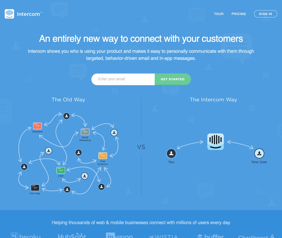
When people got to Intercom’s page then, there wasn’t an established mindset around the importance of communicating with your product’s users based on their behaviour (they didn’t even have a live chat widget back in 2015). It needed to connect with a struggle that product owners had at the time.
Now, people get to Intercom’s page with that mindset firmly established, and Intercom knows it. They can confidently start from that mindset already set: “Our popular chat is just the start. We got your other business communication problems covered.”
So if there isn’t an established mindset around the struggle your product is there to fix, if the struggle is underneath the skin for most, and not top of mind, then the best type of page for you is definitely the Struggle-First style.
Whether your thing is a product, a service offering or a newsletter, a Struggle-First page will help catch the people visiting your site, make then say “I feel understood!”, and will help with the word of mouth too.
Oh, and speaking of word of mouth: if you’re in a crowded space, and everyone else is using a Features and Benefits page… well a Struggle-First page will set you apart.
Look below for some past articles to dig deeper or look out for more articles on this topic soon.
Stay Sharp!
—
Pascal Laliberté
@pascallaliberte