How Can I Improve The Design Of This Landing Page Without Too Much Effort?
On this post on Reddit, the poster asks for feedback on their SaaS app’s website.
I’m really after some thoughts on it. Be it design, text or the overall project as a whole.
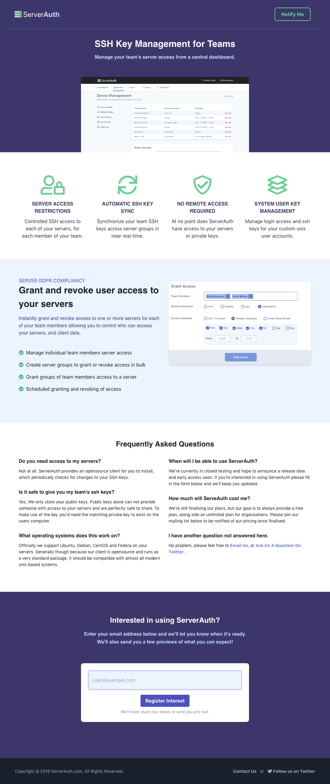
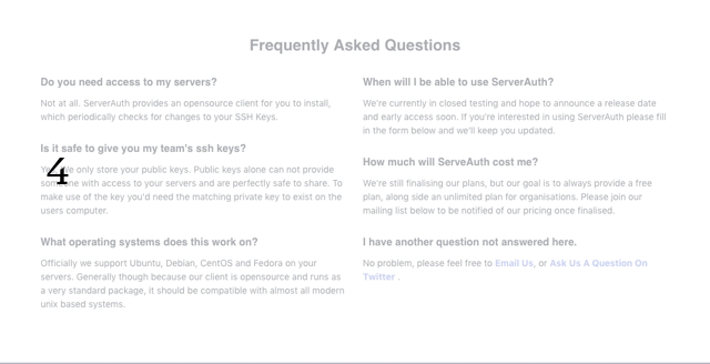
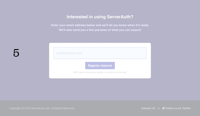
This Site Is Already Pretty Good
- It includes a concice and descriptive heading;
- It addresses concerns by being up-front about how it works and what it doesn’t do;
- There’s a way to be notified;
- It’s fast to load;
- It’s visually clean.
How can this landing page be improved?
Three Questions To Sharpen The Page
There are ways to sharpen this page up without redesigning the visuals or investing in creating unique imagery.
Using mostly text changes, and by putting ourselves in the perspective of the person coming to the site, the page can be made more impactful.
Here are some questions to help us do that:
Question 1: What’s it like before I come looking for this website?
Tell me about what it looks like to be in a situation where this is a life-saver. What’s been so bad that the person decided to put aside everything else in their to-do list and address this problem they’re having?
You have a shot at a product if the pain is real, felt, and won’t go away with in-house solutions.
So what does that pain look like? Could you put together a paragraph describing the pain in vivid details?
With that knowledge, consider starting the page recounting the painful story that needs fixing, so visitors could relate and associate.
Question 2: What does the back-and-forth look like in the mind of the visitor?
Beyond the rational reasons for making a purchase, the person who has the power to make the purchase decision will experience a back-and-forth in their mind, a mix of rationality and emotion.
What does that back-and-forth look like?
There are four forces that are typically at play in the mind of the buyer.

If the top two are stronger than the bottom two, you have a sale. If the ⚬→ struggle is real, and the →⚬ attraction outweighs the ←⚬ anxieties and the feeling of “I’ll just do it myself” (⚬← habits of the present), you have a sale.
With that knowledge, consider addressing the “I’ll just do it myself rebuttal” somewhere on the page, by showing a situation where the app could outshine home-grown solutions, which are your real competitor.
Question 3: What thoughts come up as the visitor scrolls down the page?
The back-and-forth is dynamic, and will change as the user scrolls down the page. There won’t be a single direct line from “I have this problem” to “yes, this app, now”.
So what thoughts will your visitors experience as they scroll down the page? When they read this paragraph, what forces in the Forces of Progress will grow in size as a response (attraction, anxiety, “my current habits will do for now”)?
With that knowledge, consider making the much page longer to allow for several shots at making your point through different angles, by using different methods.
A New Structure For The Page
The current structure of the page looks like this:
- Concise preview of the app and what it does;
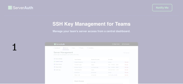
- List of details to re-assure anxieties, explain what it does;
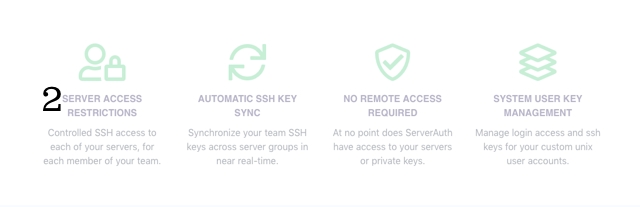
- A visual on how it works and a list of relevant features;
- A list of questions and answers;
- A call to action to be notified when it launches.
A proposed new structure, based on the insights from the questions above:
- A vivid description of a typical situation that people want to move away from, so visitors can relate and feel understood in the struggle they’re currently going through;
- A “wouldn’t it be nice if” section explaining a solution;
- An example rebuttal “Yeah but if we do it ourselves…”, showing even more to the visitor that you understand their objections;
- “This is what we’re working on, to help you with this problem”. An introduction to the proposed solution
(similar to #1 in the current structure, reworded); - A call to action to be notified when it launches
(similar to #5 in the current structure); - List of details to re-assure anxieties, explain what it does
(same as #2 in the current structure); - A visual on how it works and a list of relevant features
(same as #3 in the current structure); - A revised list of questions and answers, addressing more areas of pushbacks, including more trust-building answers and showing you understand their concerns
(similar to #4 in the current structure); - Another call to action to be notified when it launches
(same as #5 in the current structure).
With this new structure, with just a little bit more writing, the page could make the visitor feel like their problem is understood, that their own pushbacks are understood too, and allow them the space to think things through with multiple chances at absorbing the information as they scroll down the page.
Stay Sharp!
—
Pascal Laliberté
@pascallaliberte