Re-writing Headings That Just Highlight The Benefits
Let’s say you’ve got an app like this one and you’d like to improve the main heading on the app’s marketing landing page.
Quick Run-Through of The Product For Context:
To help know how to re-write that heading, here’s what the app does:
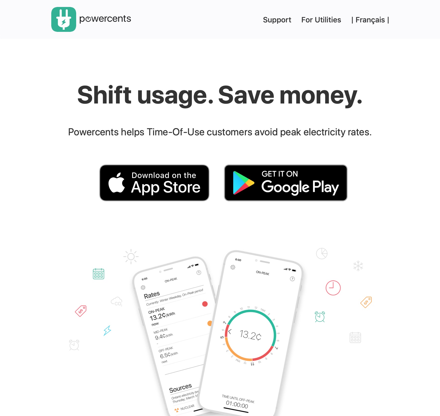
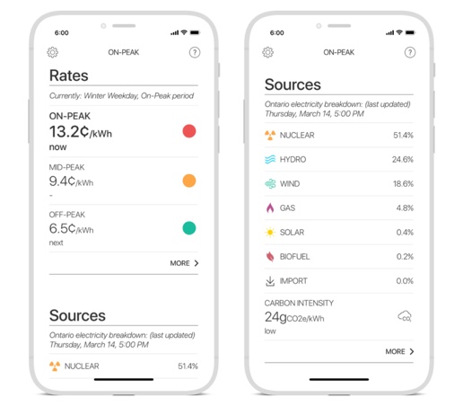
Powercents helps people know the cost of using electricity (the rate) right now, and at what time that rate will change. For those who live in the province of Ontario, it also tells you the breakdown of how the electricity is being generated (Nuclear, Hydro-Electric Dams, and so on.)
Brief aside: this app was built by Tim, a friend of mine who runs Energy Insight and Gridwatch and he graciously agreed that I write an article with suggestions on improving his site. Thanks Tim!
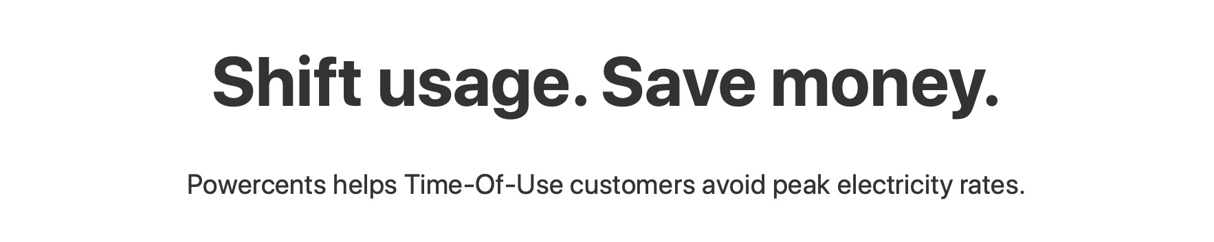
So let’s look at that top heading: “Shift usage. Save money.” Let’s see how we could improve that.
Benefit. Other Benefit.
This heading highlights two benefits of using the app. You could say that these benefits are essentially what you get when you use the app.
First of all, it’s meant to be enticing. Who doesn’t want to “save money”?
Plus, it’s a short headline, has few words, and gets to the point. Short and to the point are good attributes, but they’re not super crucial.
Connecting With the Brain of the Visitor
What’s more crucial than short and to the point? Does the heading connect with the words the visitor has in her mind when coming to the page?
How else could we write this heading to connect with the visitor as she falls on this page?
Tip: To quickly try out edits on your own site, here’s a trick I use to make any page temporarily editable.
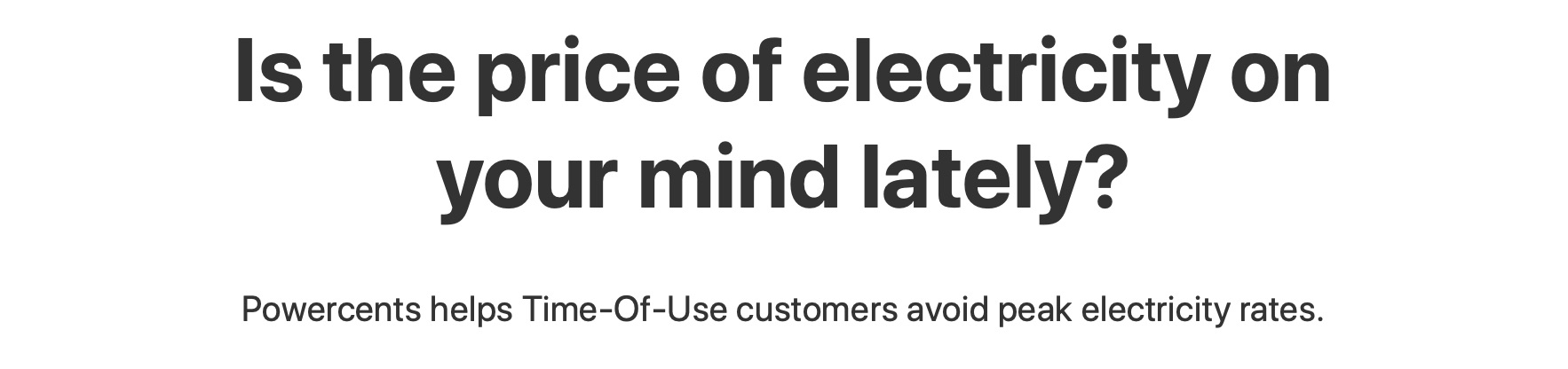
Option 1: The heading could be posing a question
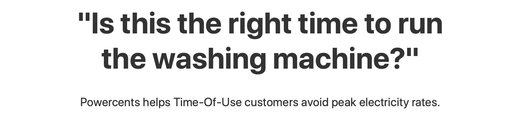
Option 2: The heading could be quoting (sort of) something that might be going through the mind of the visitor, vividly describing the visitor’s struggle.
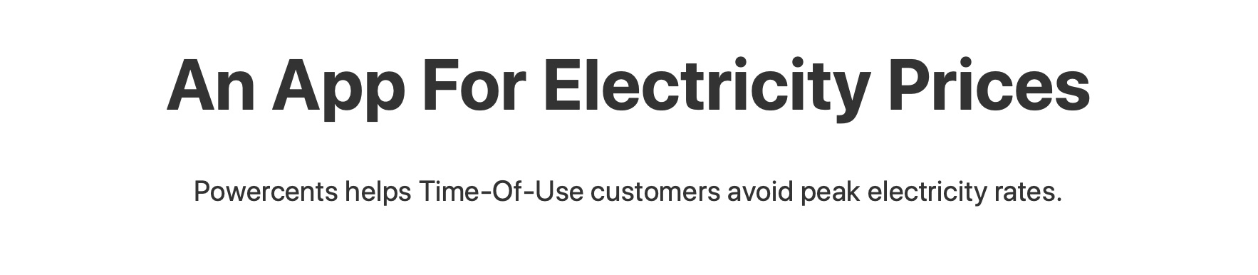
Option 3: The heading could be using the words the visitor might have typed in Google. In this case, we’re hypothesizing that people will be searching for the search phrase [electricy prices app].
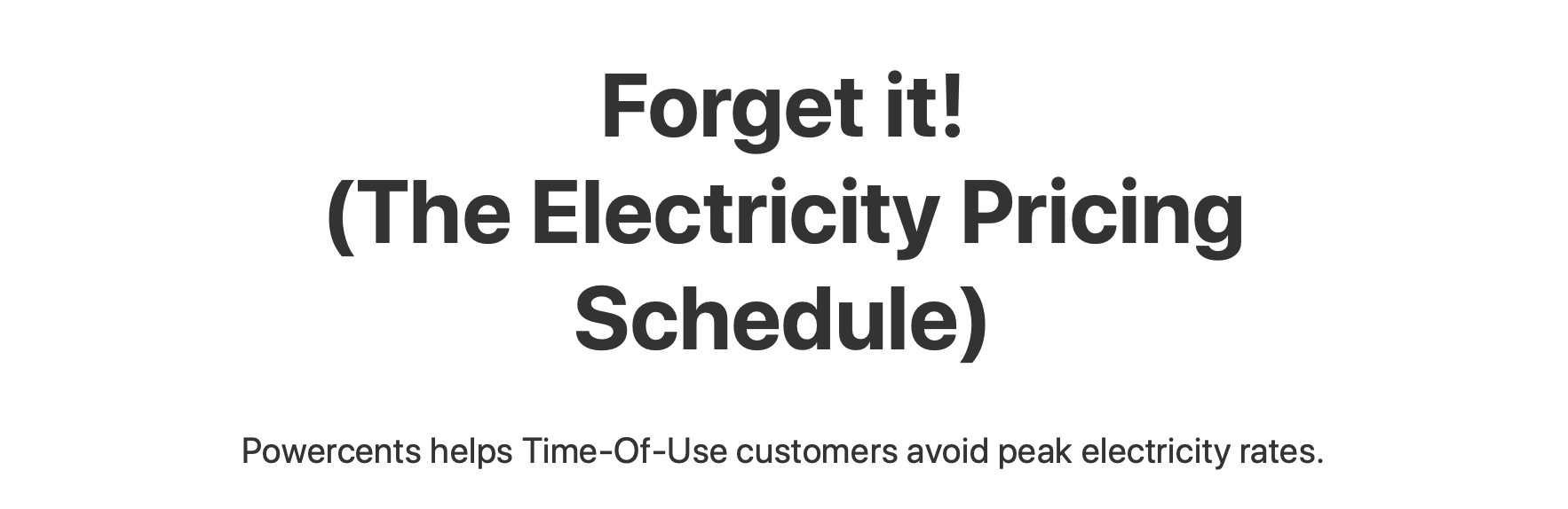
Option 4: The heading could be grabbing attention with something provoking, punchy and unanticipated.
So which heading is the best?
If your site has enough visitors (say, 10,000 visits a month), you could run an A/B Test to know which one makes a bigger difference in the number of conversions.
Otherwise, there is a way to become confident about your choice. Consider finding the situations that cause people to visit your site in the first place.
Confidence In Choosing A Heading: The Job This Product Is Hired To Do
When people make a choice to say “yes, this, now” to a product, there’s some back and forth happening in their mind. Even if the product is free, they will be weighing the choice, rationalizing, listening to their emotions, hesitating.
For more background on these concepts, check out this article on how situations are what cause people to move forward on a problem, or this article explaining the Forces of Progress, and this one explaining how your product competes with people choosing nothing at all instead of buying something.
In the case of Powercents, the situations preceding them hiring this product (the “jobs” they have to get done) would look like these:
Job #1: When I arrive in the province of Ontario and I realize there are different electricity prices based on the time of the day or season, I search for something I can print out or an app so I can have the schedules handy.
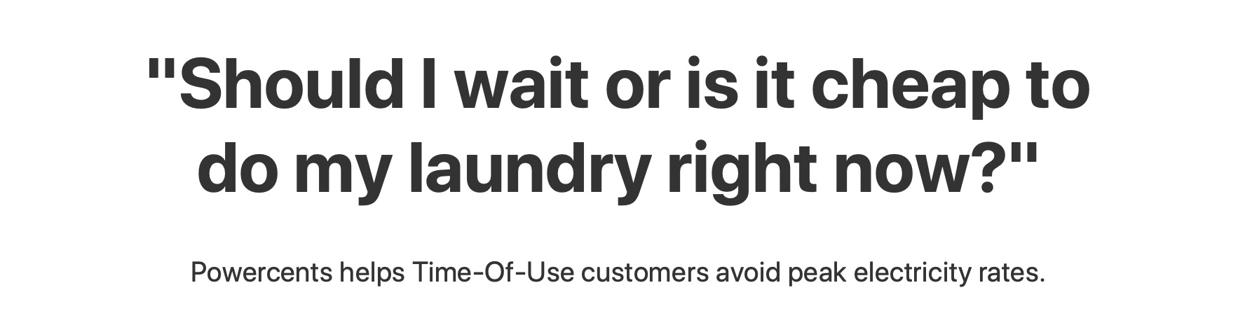
Job #2: When I’m about to do laundry in a time of day that might have high electricity prices, and I don’t want to run upstairs to check the sticker next to my fridge, I look for a web page or app that can tell me the current electricity price so I can decide if I should wait.
Job #3: When I suspect today’s a holiday where electricity prices are lower, I look for a web page or app that tell me the list of electricity rate holidays so I can know if I should wait to another time to do my chore.
What do you notice about these situations?
I notice a couple:
- All three situations would be well-served with just getting to a web page with that information. The app (which needs installing) is competing with a web page that you can search (which you don’t need to install). There’s a cost, a mental overhead to downloading (committing to the app). The app’s marketing page should quell any fears, re-assure, and better serve the core job.
- Two of them are about the “Should I Wait” struggle. That’s interesting. We could use that phrase in the heading or somewhere else in the page.
Other Improvements To The Marketing Page
With this insight, we could make these other changes to the marketing page too:
- We could change the graphic to illustrate this “Should I Wait” struggle. Maybe show in the main image some electricity-intensive chores that are needed to be done.
- Address the anxieties around downloading the app. “Am I going to have to give information away?” “Is this app going to collect my private information?”
- Make the page compete with any other web page showing that information. Or just actually show the live information right on the web page (no need to download the app). That will sow trust, and build the site’s audience, which is the toughest problem to solve in marketing a product.
So in the end, I’d consider running this heading for a while and see how that feels, until I can interview some new users:
Stay Sharp!
—
Pascal Laliberté
@pascallaliberte