An Example Of An Unconventional Landing Page
Startups use it, web agencies use it, products, services, big companies and small companies use it.
There’s a trend in landing page design, and it looks like this:
The Convention In Landing Page Design
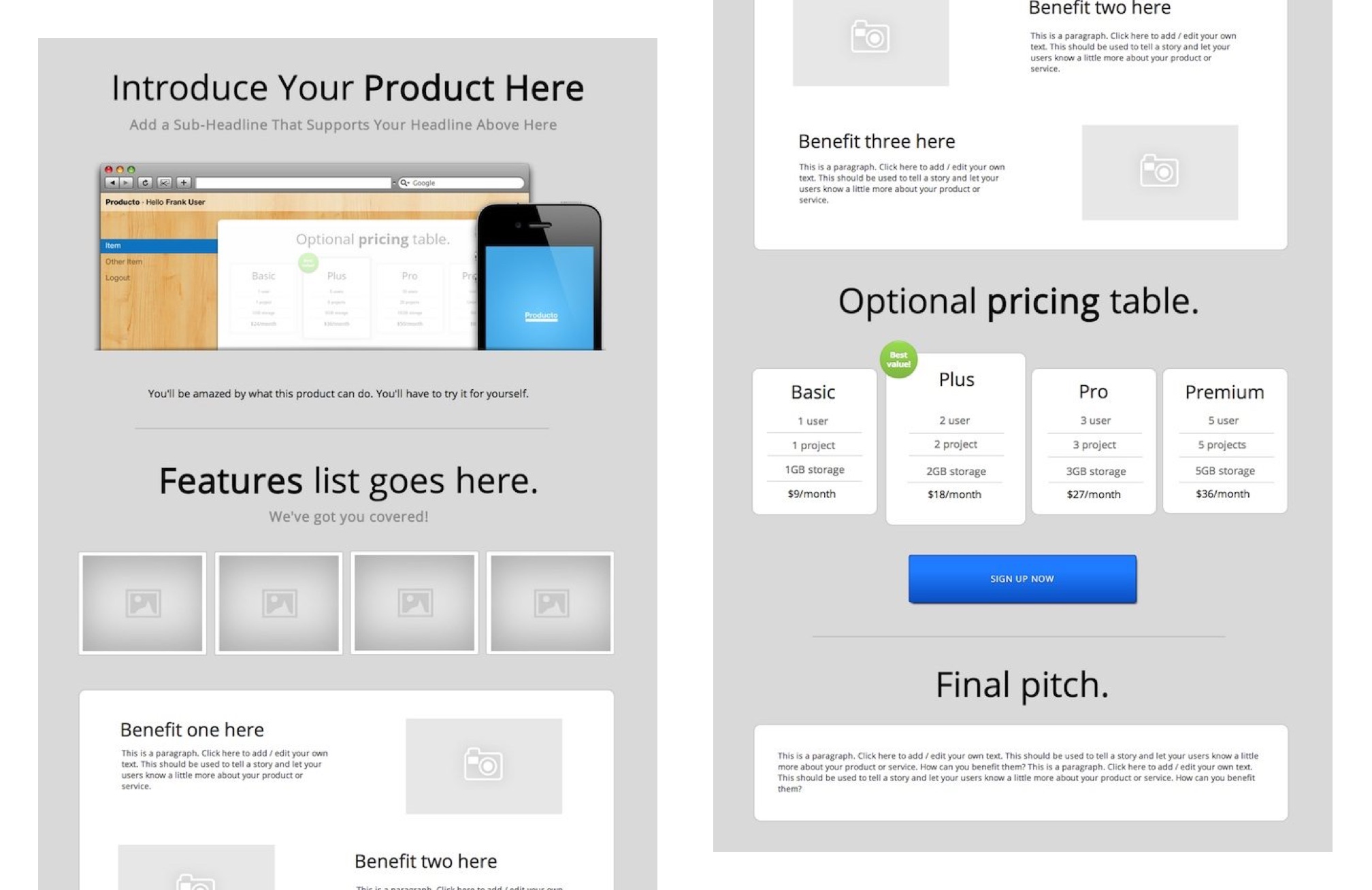
It starts with a big headline and an enticing image before you scroll, a blocky design where you scan from left to right, lots of icons and images.
Oh, and the text better be short.
So that’s the convention.
If You Don’t Want To Follow The Convention
As an example of an unconventional landing page, let’s look at the design of clean-ruby.com, which sells a book that addresses the following struggle:
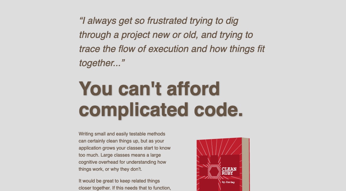
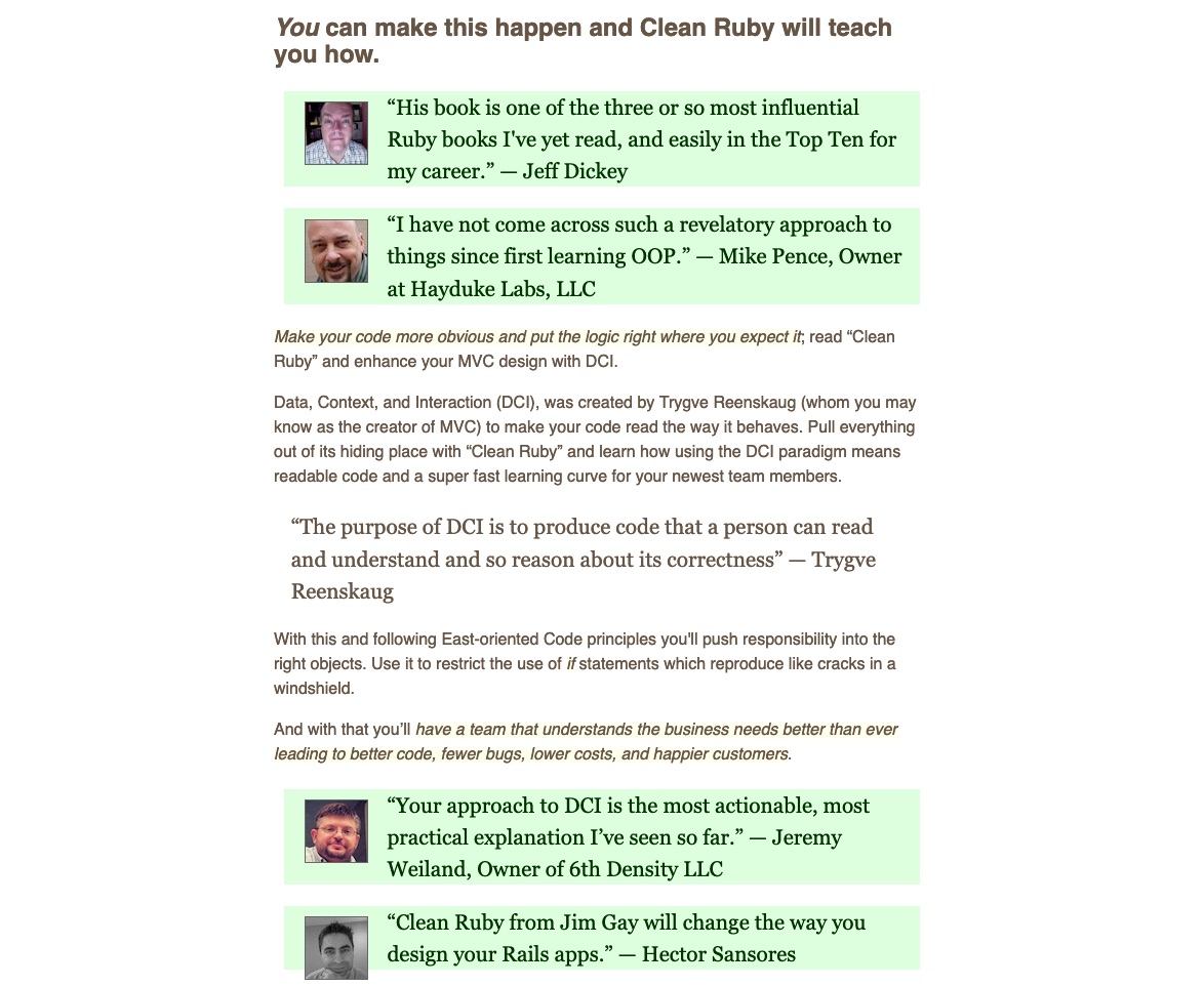
Notice these things with the top of the page:
- There’s no logo in the top left;
- There’s no menu in the top right;
- The title could have stated “Clean up your code”, what you’ll get with the product, but it doesn’t;
- There’s a lot of text, and it clearly doesn’t aim to be concise;
- The graphic peeking from the bottom is nothing fancy;
- The book title is downplayed, and only shown in small on the image of the book.
Instead of focusing on the product too much (all you know is that it’s a book), the page focuses on the situation the visitor is dealing with. The page starts with a quote relating the struggle, the pain that the visitor might be experiencing just before coming to the site. The visitor will either say to herself “I’m in the right spot” (continue scrolling) or “I’m not in the right spot” (hit the back button).
There are no traps, no gimmicky promises to make people scroll. The top of the page is honest, and that’s what makes it stand out.
Let’s scroll.
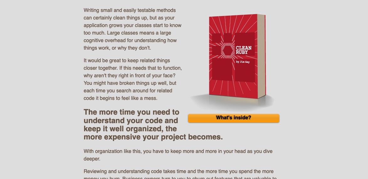
If you’re intrigued and you’re ready to give the book a shot, there’s a button to press to do something about your curiosity.
The button doesn’t say “Buy this book”. Instead, it invites the user to delve deeper with the most likely next step: “let me see what I’ll be getting”.
Also, notice the bolded text saying “The more time you need to understand your code and keep it well organized, the more expensive your project becomes”. That line describes something important. It describes the book’s real competition, which is to try continuing what the visitor was doing before coming to the site. There’s a pitfall with staying the course. And the book solves that pitfall.
Let’s scroll some more.
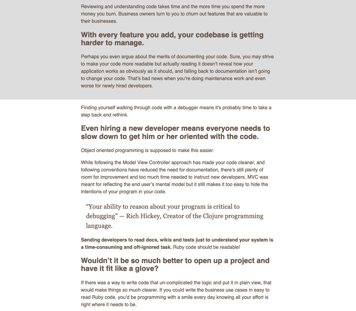
This next part goes even deeper showing how the status quo will continue to hurt. It says “you’ve tried these other alternatives, or you considered them, but you know they’ll hurt.”
Tucked in, written is small print just before that last header, is a gem of a line: “Ruby code should be readable!”. The author could have easily bolded that line, but he didn’t have to. If the visitor read the preceding paragraphs, you know that line lands a punch. It describes a better future, an aspiration the visitor will surely be having. It builds on the reader’s momentum, seals the deal, and leads straight into the next heading: code that “fits like a glove”.
So Far, The Page Has These Properties
The Page Shows That It Understands the Visitor
By now, the page demonstrated that it understands the visitor’s struggle, understands the real options the visitor is considering, and honestly points to a way out of the mess.
The Page is Unconventional
- There’s lots of text. It bets on text to provide multiple shots at delivering the words to connect with the visitor’s worldview, words that describe her problem vividly.
- It’s not optimized to convert every visitor into a customer. It’s optimized to match the product with the right visitor. This page is built to allow people to go away, confident that if they continue experiencing the problem, they’ll surely be coming back to find the solution.
- It takes a long time before it talks about the product itself. And as you’ll see, the next section doesn’t talk about the product yet either. That only comes after this next section.
The whole top of the page leading up to this section shows that it understand the struggle. That latest section offers proof that the product has worked.
The Product Is Described Half-Way Down The Page
Now we’re half-way down the page, and only now are we talking about the book’s contents:
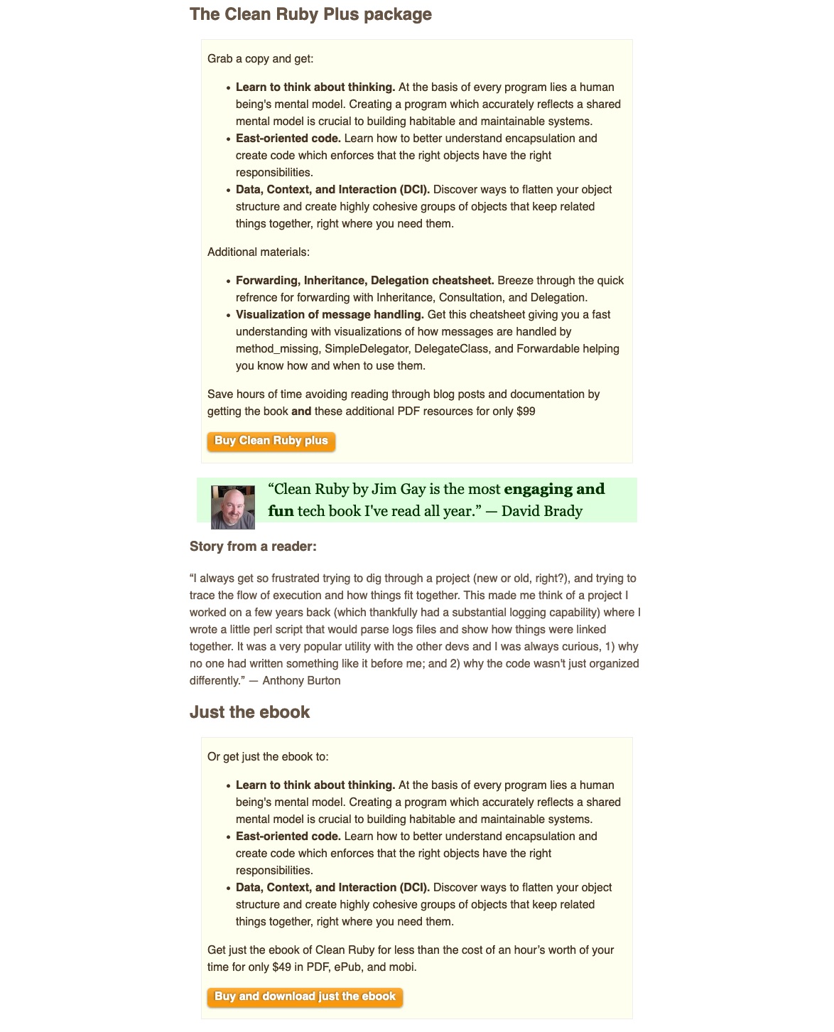
The next section shows the visitor that the book comes in two varieties, two packages: The Plus package, or just the ebook. Those two packages compete against each other. No longer is the book competing against “I’ll just do it myself”. Now, the two packages are setup to compete against each other.
Notice how small the price is? It’s super small. That’s because the price is not the book’s central feature. The price is just a formality at this point.
Between the two packages, a quote is inserted to offer another proof that the book works. It’s in the periphery of view, and anchors the visitor back to the struggle that needs solved. “I always get so frustrated trying to dig through a project”.
The next section catches the tension caused by the two packages:

If the visitor is still considering doing it themselves (choosing neither package), the page offers a way out: get a free chapter and be on the mailing list.
You want in on the knowledge but don’t want to commit to a book? Commit to smaller chunks. That’s because the biggest anxiety to buying a book isn’t the price, it’s the book’s length that’s the biggest anxiety. Make a smaller chunk to bite, and you get commitment.
And finally, the bottom of the page offers another way out: discover the author.
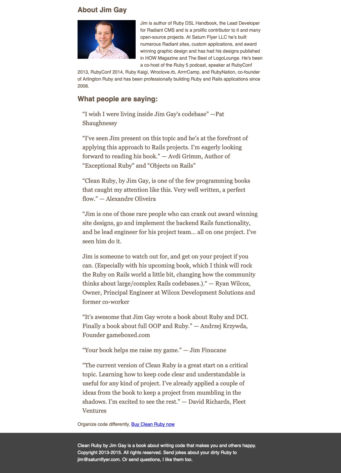
The page ends with even more proof that the author is a source of knowledge. At this point, the visitor is considering these options:
- Just continue doing it themselves
- Buy the Plus package
- Buy just the ebook
- Get a smaller chunk and get the free chapter and newsletter
- Just follow the author to remember who to come back to later
And for those who thumb-scrolled all the way to the bottom, they’ll find a very modest link to buy the book, supported by a modest one-liner describing the outcome of learning the book’s knowledge. “Organize code differently.”
Closing Observations
- This page is unconventional, but it’s not unique. You’ll find many of these purposefully-crafted landing pages across the web, by people making a good living from their modest products.
- This product is not an ebook. The product that’s sold, and it’s sold by the entire page and all its options, is something different. The product that’s sold is a better version of the visitor. All the options are about helping the visitor with their struggle, and offers the visitor to upgrade her abilities.
In that sense, the page really isn’t about the product. It’s about helping the visitor’s struggle. And apparently, that’s unconventional.
Stay Sharp!
—
Pascal Laliberté
@pascallaliberte