"Too Much Text": What to Do About that Feedback
You’ve created a landing page for your service or your product, and when you ask around for feedback, you get this:
Too much text.
Maybe your page needs to be reworked a bit (I’ll cover some tips below), but…
You probably don’t have too much text on your page. Hold on before you make some edits.
I’ll explain a bit about where that kind of feedback comes from (it has to do with the reviewer’s brain mode), but first, let’s look at a great landing page which, you guessed it, got exactly this kind of “too much text” feedback.
Apparently, This Page Has Too Much Text
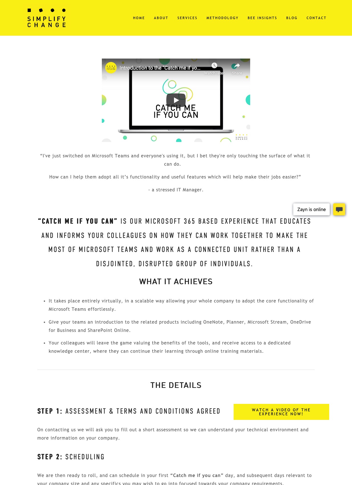
Here are bits from the feedback people gave:
It’s way too much text so I don’t feel motivated to read this. Try to make it more concise. Structure the text in bullet points and sections.
No.
I feel like the first section should be more concise, currently it has more text than the “The Details” section.
You’d think that’s a problem, but it actually isn’t.
I’d move some stuff down, also maybe change a bit the formatting to highlight the important bits of information.
Now we’re getting somewhere. That bit about highlighting important bits is on the right track. We’ll get to that in a bit.
But first, let’s see why people give feedback like this.
Two Brain Modes: The Trap in the Feedback
Maybe the reviewer doesn’t know about the product like you do…
Maybe the reviewer doesn’t have a need for the product like a real buyer would…
Maybe the reviewer is comparing your page against all the other pages that she saw in the past…
But that’s not the real problem with page reviewers.
It’s about brain modes.
Brain mode #1:
I’m using the creative part of my brain to give feedback about a page
Even before I get to the page, I put myself in a mode of looking for what needs to be corrected, and I fire up the brain cells that have to do with composing a response, with editing, with formatting, with judging.
That brain mode is not the brain mode your actual buyers have when coming to your site.
This is important. When usability researchers conduct tests with real users, they make sure to avoid this creative brain mode at all costs. They painstakingly make sure to put the test participant in a real situation where they have to accomplish a task. They ask questions like “tell me about what’s going through your mind, out loud, as much as possible”. There’s a very good reason for this. They want to simulate reality and they want to understand people’s unconscious reactions by verbalizing them.
In reality, your visitors are not in a critiquing/creative mindset when coming to your page, they’re in a transactional mindset when coming to your site. And there’s a lot of messy stuff going on internally that they’re not verbalizing.
There’s no way that a reviewer in brain mode #1 is in a good place to give you valid feedback about your site. Take their feedback with an inflated-brain-sized grain of salt.
Brain mode #2:
I’m trying to solve a problem when I fall on your site
- I have words in my mind.
- I have my own vocabulary to describe my problem.
- I scan the page to look for words that are familiar to me. I scroll up and down, read a bit, scroll some more, read some more.
- I experience pushes and pulls in my mind as I go down the page.
This is the brain mode you want your reviewers to be in when looking at your site.
And they’re probably not going to be in that mode when they give feedback like “Too much text”. In the real world, wordy pages work.
Wordy Pages Work
In a tweet, Anne-Laure Le Cunff shared her regret at ditching her wordy page design for a more conventional, less wordy page design:
A month & a half ago, I replaced my super simple text-only design with a fancier one
Since then, my conversion rates have plummeted (-50%), so I’m going back to a super simple text-only design
Moral of the story: bells and whistles ≠ good for business
Want more examples? Here are articles of wordy pages I showcased:
So you’re left wondering: what can I do to improve my wordy page?
Improving Your Wordy Page
Words, And Their Place on the Page
Words have a central role on your page. That’s because your visitors have a head full of them. Visitors come to your page with a vocabulary describing their problem, their feelings, their anxieties, their aspirations, their pain, their struggle, their dream, their own way to describe the solution they’re hoping you’ll offer.
It’s your job to:
- Place on your page the words that your visitor has in their mind, where the visitor is looking for those words (it’s usually on the left of the page, more below).
- Give multiple chances for your visitor to connect to those words. That’s why a long page offers multiple opportunities to help your visitor feel they’re in the right place. Allow them to scan your page.
Let me me show you an example, to make a point:
You’re Scared You’re Using Words Wrong
I made that headline to prove a point. Whether you scrolled and stopped, or whether you read this headline in sequence with the rest, that headline likely produced a reaction.
That’s because that headline has words describing a struggle you’re likely going through.
Start with Some Words Describing the Struggle
Let’s revisit that example we looked at above. Let’s zoom in on the first few words to appear in the body of the page:
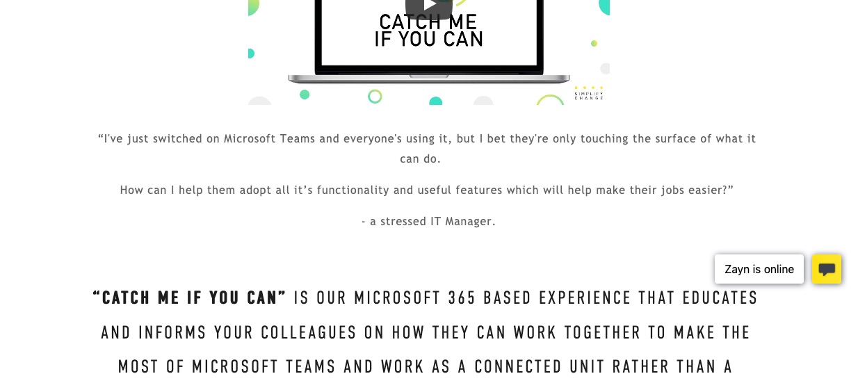
“I’ve just switched on Microsoft Teams and everyone’s using it, but I bet they’re only touching the surface of what it can do.
How can I help them adopt all it’s functionality and useful features which will help make their jobs easier?”
– a stressed IT Manager.
Those. Are. Great. Words!
These are words describing the struggle. They’re potent at connecting with the mind of the visitor if they’re experiencing the struggle your product or service is there to solve.
Feedback on this part: I’d make those words bigger on the page. Just a little bigger. Keep the contrast with the following “Catch me if you can” paragaph, but just make sure those struggle quotes aren’t downplayed too much. They’re too good.
And if your visitor doesn’t connect? Well they might leave, or they might scroll. And then they’ll fall on a new set of words…
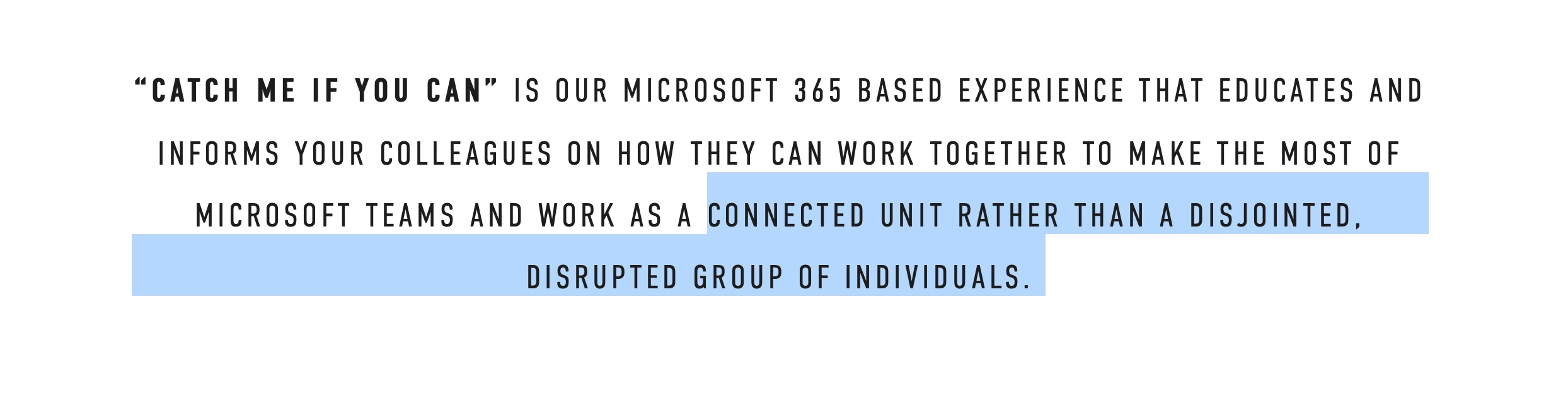
Feedback on this part: Another reviewer said there was too much all caps. I’d say “maybe”. But what I would do, is I would repeat those very strong struggle words as a heading just below, something like:
From a Disjointed, Disrupted Group, to a Connected, Collaborative Group.
Something to consider.
The Left Side Is Where You Should Place the Words
In Latin-based languages, we read left to right.
That means that your visitors will scroll the page and their eyes will scan the left-most words first. If a word connects, they’ll read to the right, pay closer attention to what’s in the periphery of that word.
This is called front-loading your sentences. Putting the important words first.
And it goes without saying, but it’s good idea to help your visitors by bolding words that will be helpful, or by using contrast techniques like text sizing, paragraph widths, and using lists here and there.
Use the Force(s): Make Sections Flow.
In the mind of the visitor, there’s going to be a mix of forces pushing toward “yes”, pulling back toward “no”.
So make the page flow by building on the enthusiasm, the anxiety, the curiosity, that the previous section just created.
Does one section likely create a question in the mind of the visitor? Answer it in the next section. No need to rely solely on an FAQ for lumping all questions and answers. Answer that question right there, in the flow.
Build on the momentum your page creates by serving your visitor’s mini-struggles as he goes down the page.
The best order for your landing page is to make sure your page flows.
Keep Your Wordy Page!
So be confident with your wordy page. Just make sure that you understand the situation your visitor is in before coming to your page, her words, her state of mind, her struggles, and you should be good to go.
Stay Sharp!
—
Pascal Laliberté
@pascallaliberte