Sharp Example: Palabra Sign-Up Forms
Last time we looked at what makes a landing page have a good flow.
What should the page start (the flow) with? We looked at this heuristic:
- If your audience has an established mindset for the product and its need, starting with a Hero (a big full-screen intro) describing the product is not a bad idea. Less is more, to the point, nothing wrong here.
- But if your audience does not have an established mindset for the product and its need, a simpler headline and short text isn’t too helpful. Instead, start the page with “struggle-first” copy, copy that relates the visitor’s struggling situation to them so they can say “I feel seen” and then proceed to scroll.
In what order should we put the rest of the elements on a landing page?
To have flow, make sure the questions raised by one part of the page are answered by the next one down, naturally.
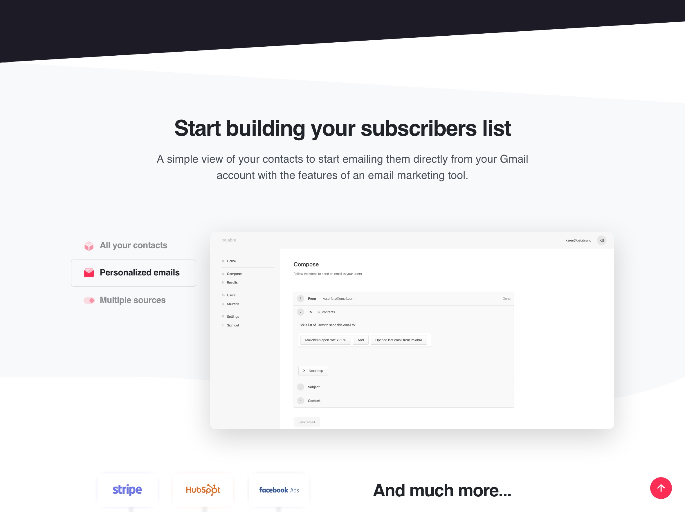
Palabra Sign-up Forms Nails the Top of the Page and the Flow
So here’s an example that nails both the top, and the flow. There’s a couple things I’d fix, but otherwise, this is not only a sharp page, it’s a surprising page too. It’s brilliant, you’ll see.
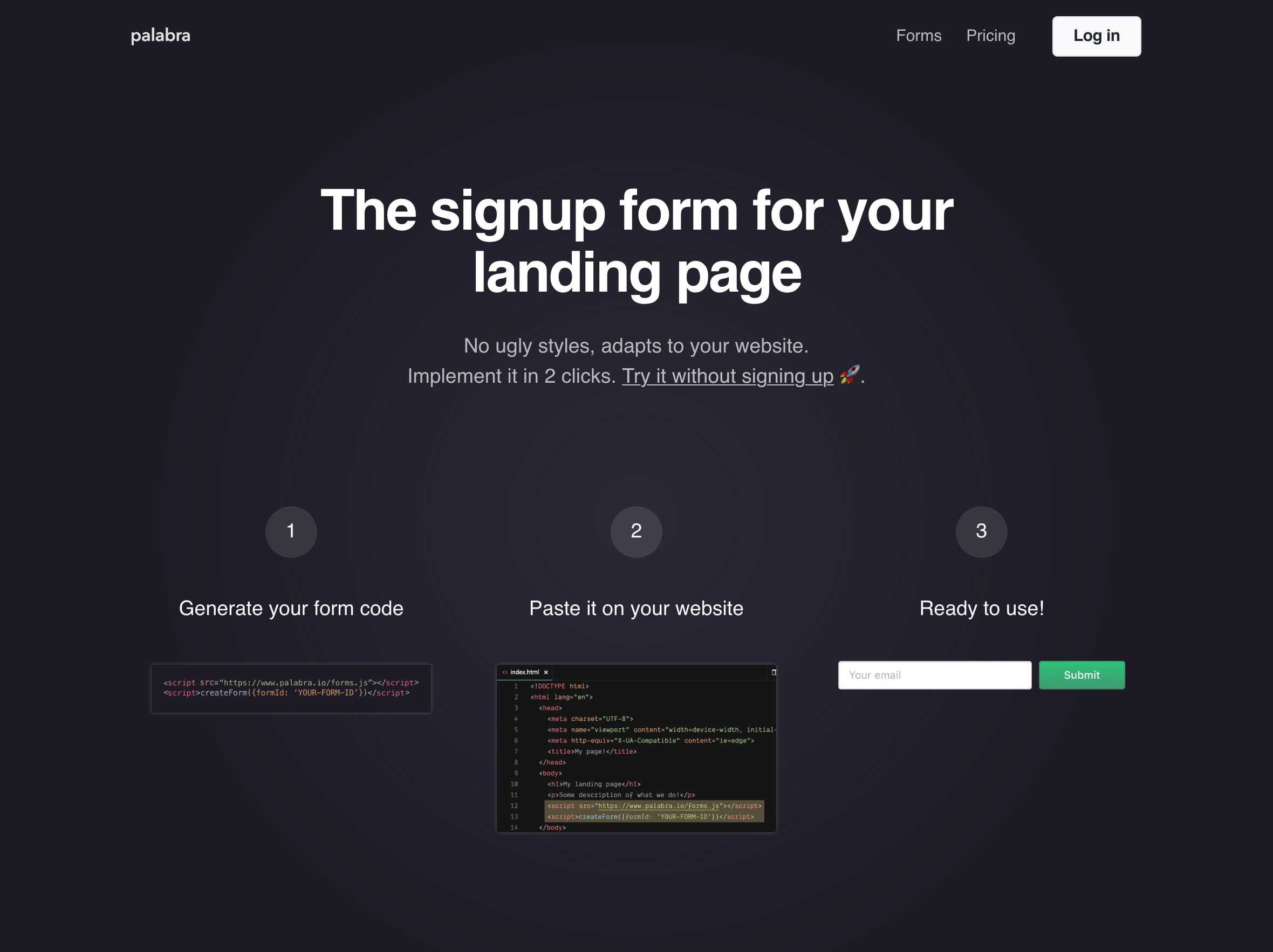
Palabra has this landing page for forms. It’s not its main home page, but forget that part for a minute.
The top doesn’t need to make a big deal about communicating the struggle (although it does in subtle ways) because its main audience already has an established mindset about the solution. We Indie Hackers know what a sign-up form for collecting emails does, we know what’s the deal with getting something from an external provider that’s going to mess up when you paste it on our sites.
But it still addressed the struggle: “no ugly styles”, “implements in two clicks”.
Visitor reaction: “Go on, go on, I’m listening.”
So it gets the top right. And the flow? Well the visitor wants to scroll, so that’s a good start. So let’s scroll.
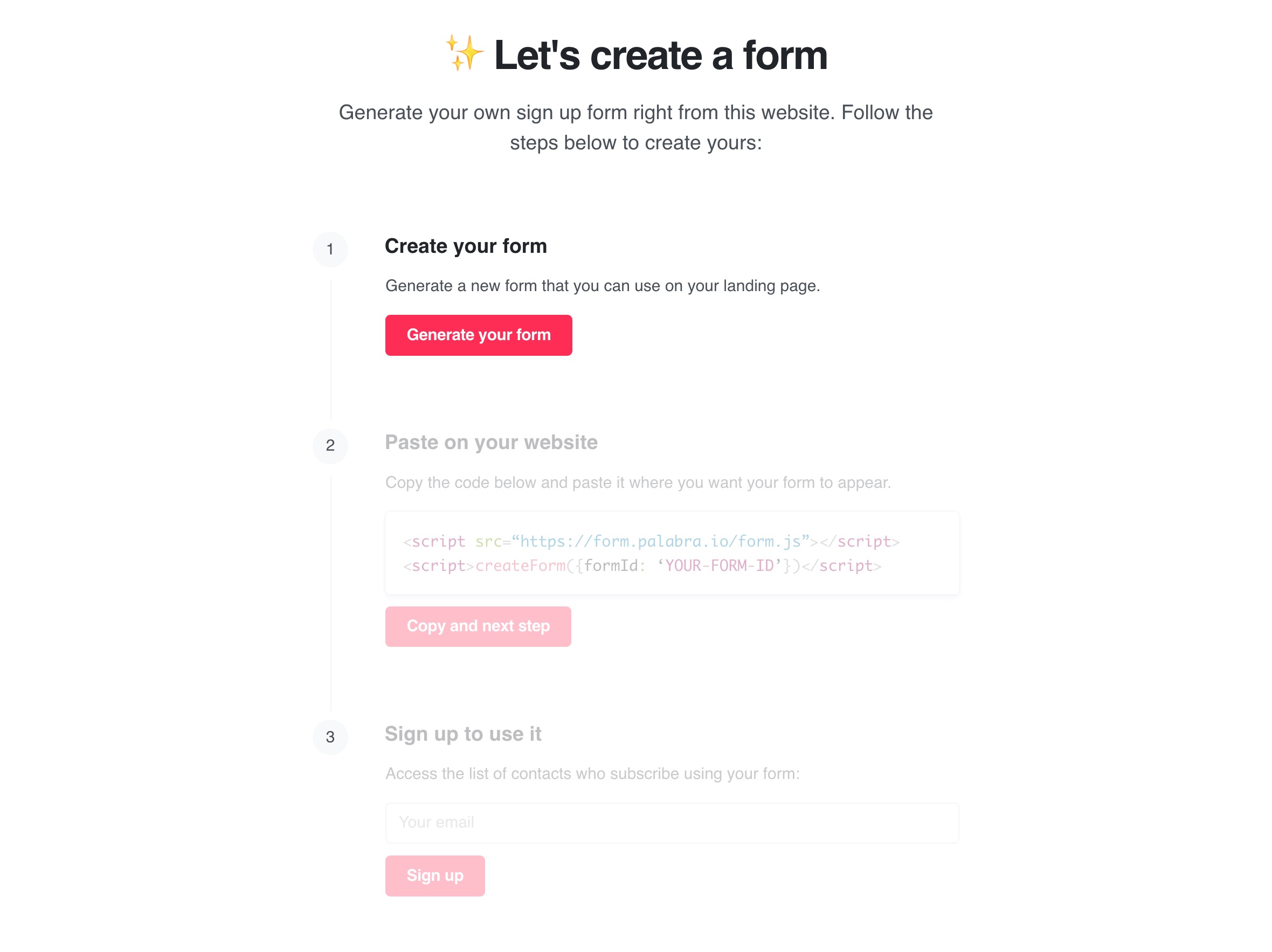
Then you see the three steps.
Visitor reaction: “Got it, scrolls”
(But these are interactive steps, not just instructional. If the visitor wants to go for it, she’ll scroll back here to try, no sweat.)
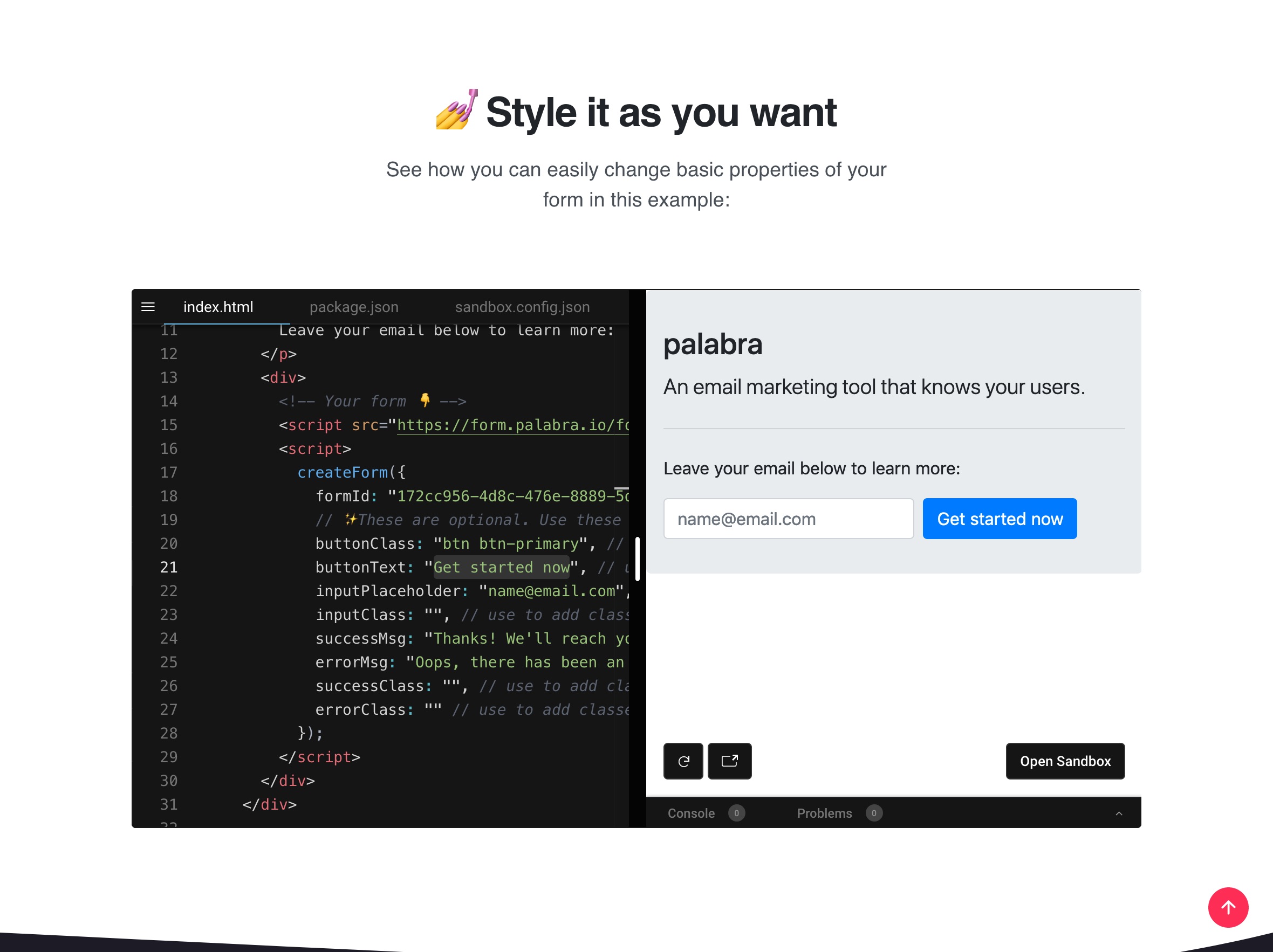
There’s a demo with live code, also interactive. Not a screenshot, a mini code editor I can play with.
Visitor: “I’m re-assured, it’s not going to inject a bunch of ugly styles I’ll need to override.”
And then, more proof:
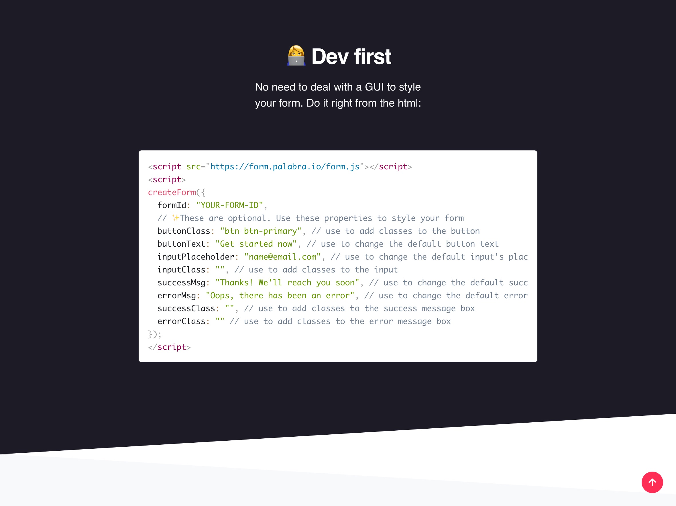
Here, the page abundantly delivers on the “no ugly styles” promise. The main job-to-be-done is solved. Aside: No problem with the repetition here, because long pages give you multiple chances to communicate to those who will scroll anyway.
Anxieties Start Piling Up Here
Although the first few sections of the page have been interactive, helpful, and have helped support the product’s main job-to-be-done, there are anxieties piling up by now:
- ←⚬ Is this tool going to secretly collect information about my site’s visitors?
- ←⚬ Will I have to pay a monthly fee for what is essentially an input field and a button? How will these people make money?
- ←⚬ What will I be able to do with these emails I collect?
I’m personally weary of installing third-party scripts on my site, and so that top anxiety is there for me.
And I know such a simple solution is probably going to be free, which means they might want to benefit from collecting emails. There’s a good chance this is a shady deal. Free products seem suspect.
So this is where I’d add something to quell a few of those anxieties:
- I’d add a box with those questions, verbatim, with some straightforward answers;
- I’d make that box subtle, but authoritative and definitive. It’s not the main focus of attention, but it firmly addresses the user’s anxieties.
The Page Takes a Surprising Turn
Visitor reaction: “Wait, what? It’s also a tool to compose emails?”
This is what I find brilliant about this page:
- It starts off addressing a very sharp struggle: just help me get a simple email collection form that will style to fit with the rest of my page. Nothing ugly. Super quickly.
- It proves that it does that job very well. The page flows well.
- But then it adds way more value. It reveals that not only can you collect emails, you can organize those contacts, and you can compose emails too.
This. Is. Flow.
The page delivers on the main job-to-be-done, and then surprises by addressing a sub-job-to-be-done that the page itself creates.
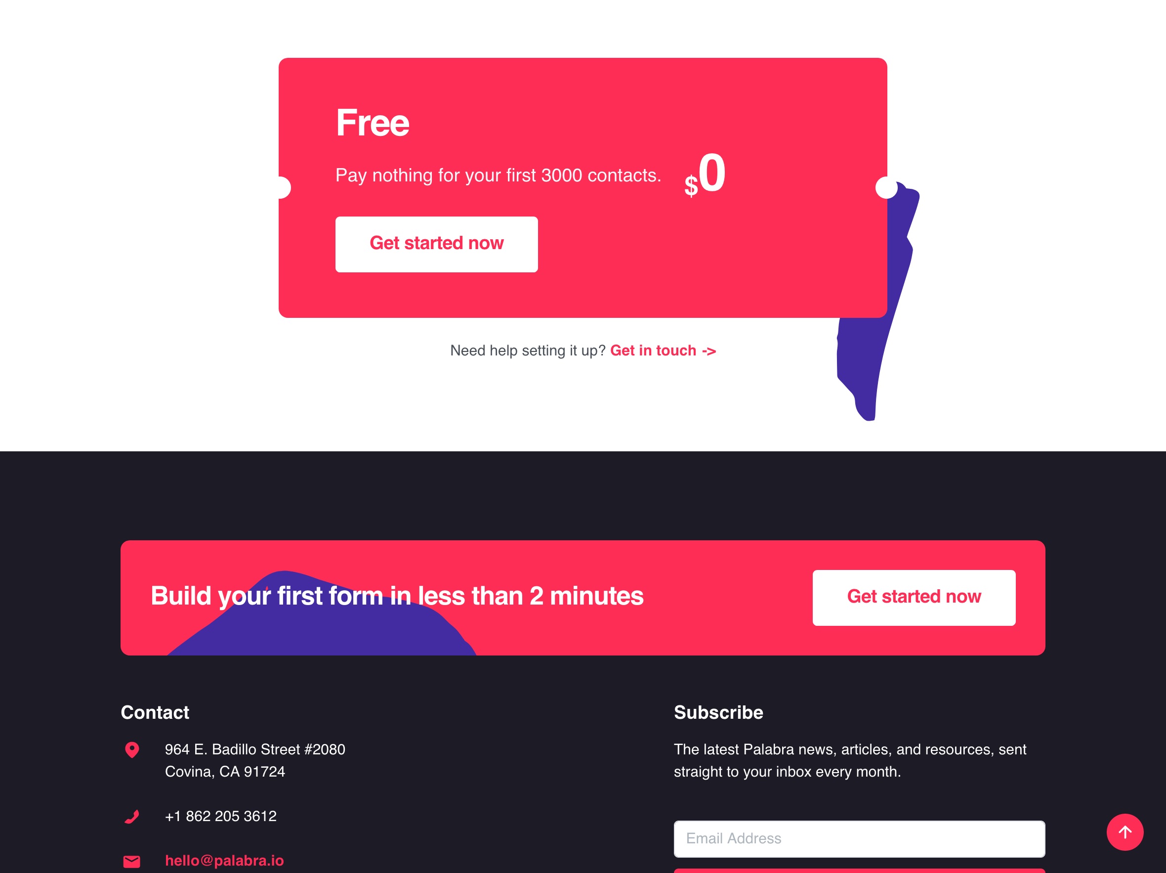
Then, the page closes by addressing pricing anxiety: it’s free, but there are ways to scale up, and that’s how they make they’re money. Makes sense: what they really offer is a system to organize contacts, the product’s other job-to-be-done.
So that’s a sharp example of a great landing page. It addresses a real struggle with panache, and helps the visitor who scrolls with a page that flows. Just a few anxieties to addresses somewhere in the middle, and it’s going to be rock solid.
Stay Sharp!
—
Pascal Laliberté
@pascallaliberte