Rewrite for InScheduler - Part 1: Initial Run-Through
Let’s try rewriting a page.
InScheduler.com offers a way for small salons or spas to help schedule and manage appointments. Sounds good so far. And the site looks pretty good too.
But let’s see what happens if we go bottom-up, starting with the buyer’s mental back and forth. This is going to be the first of a multi-part series. I expect we’ll find ways to improve the current site, make it sharper. Let’s see where this takes us.
In this article, we’ll just run through the site as a typical visitor (avid readers will know that this is just the beginning).
A Run-Through of the Site
A quick scan of the site tells me that they’re doing a lot of things right:
- There’s a demo appointment widget that you can try;
- There’s a video demonstrating the widget in action on a website;
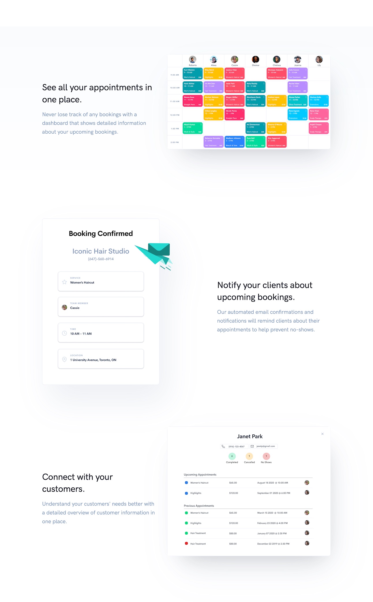
- It then shows what the shop staff sees: the calendar, the upcoming list of clients for each staff member;
- The pricing is right there, nothing complicated.
Let’s look at each section in detail, and let’s imagine a visitor seeing this site.
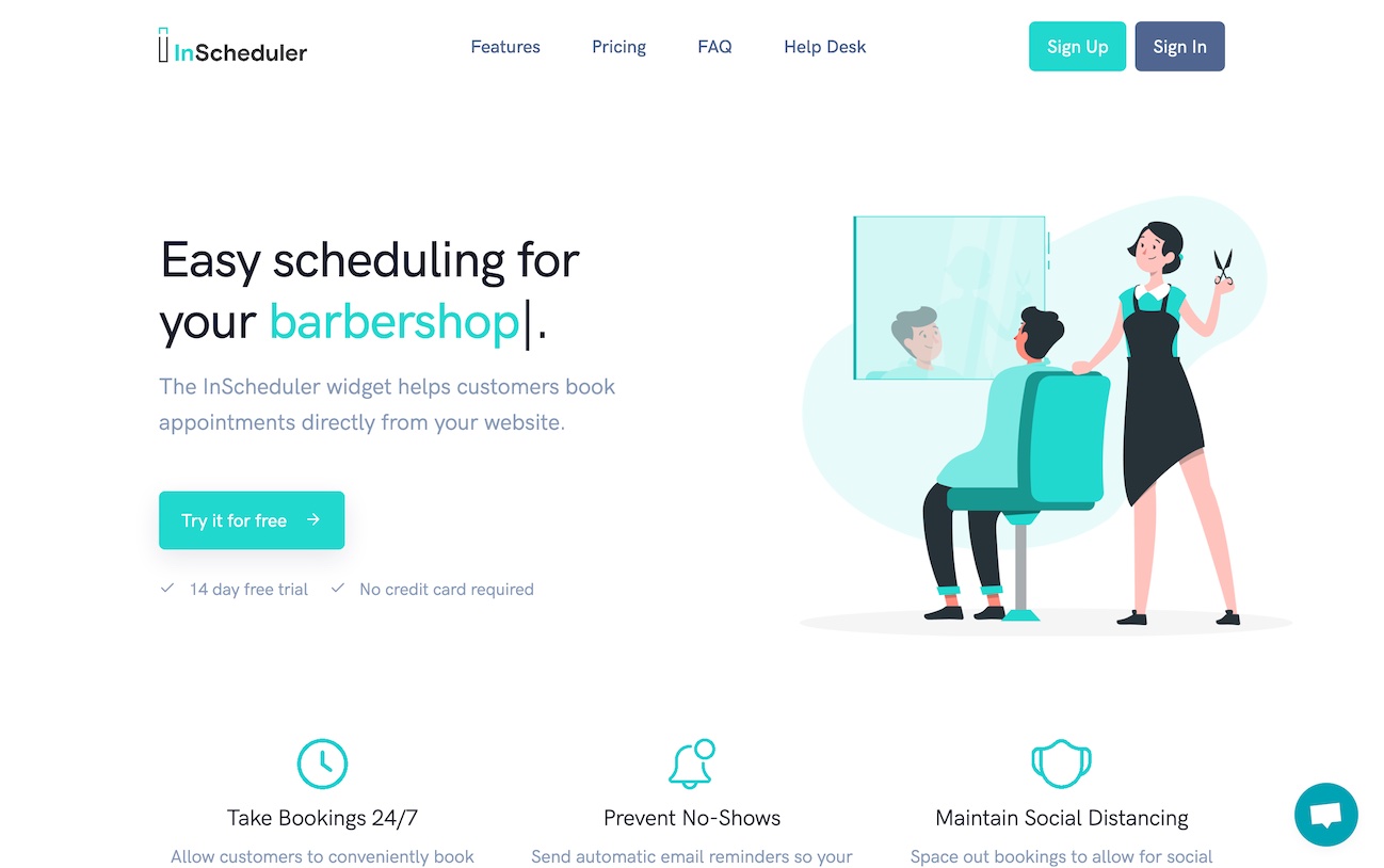
The visitor comes to the site and sees the top of the page (see screenshot above).
Nice, I’ve got a salon/spa also. Take bookings online 24/7. Prevent no-shows. I’m in the right place.
Scrolls
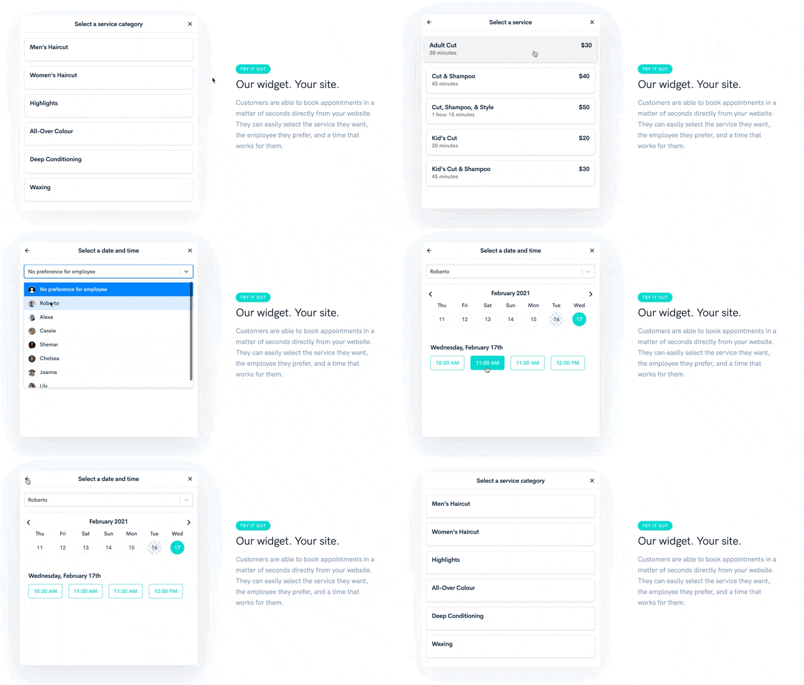
You can play with the appointment widget.
That feels pretty good. Oops, better not go all the way to the end, I don’t want to be charged for just trying it out. Neat, you can select who you prefer scheduling with. Can I specify a no-preference? Ah yes.
Scrolls
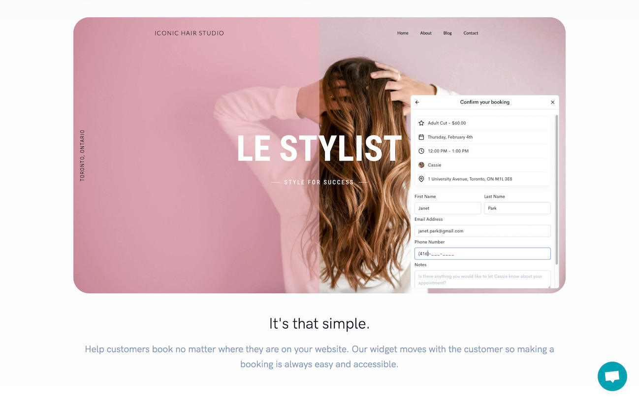
Then you can see how the widget looks on a real website. It’s actually a video.
Good, it’ll look okay on my website then.
Maybe the visitor will want to know about pricing information at this point. Maybe the visitor will think it’s going to be free. Maybe the visitor will expect a monthly amount.
And maybe the visitor will ask themselves at this point:
But who adds this to my website? Can I add it myself? I’m on (Squarespace). Can it be part of the monthly amount I pay (Squarespace)?
Note: it looks like at this point the visitor might not give the same amount of attention to what’s presented next as they scroll, because they’re in hunting mode now. Hunting for answers.
Scrolls with an eye for answers to these questions.
Okay, so that’s what I’ll see on my end, good. Still nothing on pricing and how complicated it is to add this to my site.
Scrolls some more, still hunting for answers.
Notice how the visitor now thinks of next steps above all, and thinks about the widget as being part of the website budget that has probably already been maxed out.
That’s going to be a useful lens to wear as we pretend we’re a visitor and we see this next section:
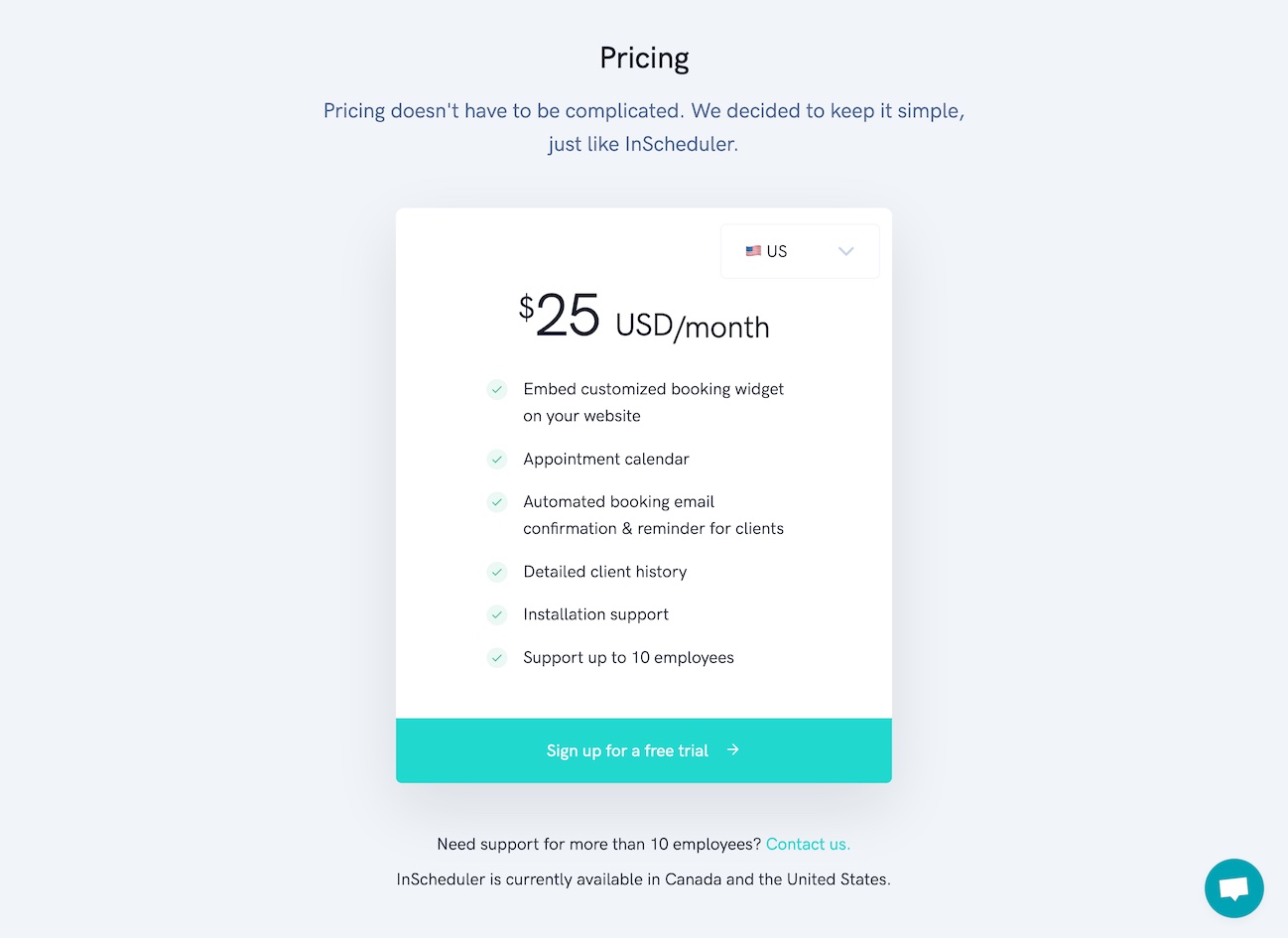
So is that $25 extra per month on top of what I’m paying for my website?
It’s good that the pricing isn’t “complicated”, as they make sure to point out, because viewed through that lens, surely something more complicated might throw people off. Viewed through that lens, all the benefits that are listed with those green checkmarks are still not compensating for the bad news that this expense is on top of what they’re paying.
And yet, I’ve got a sense that there’s a way that the way the price is communicated could be improved.
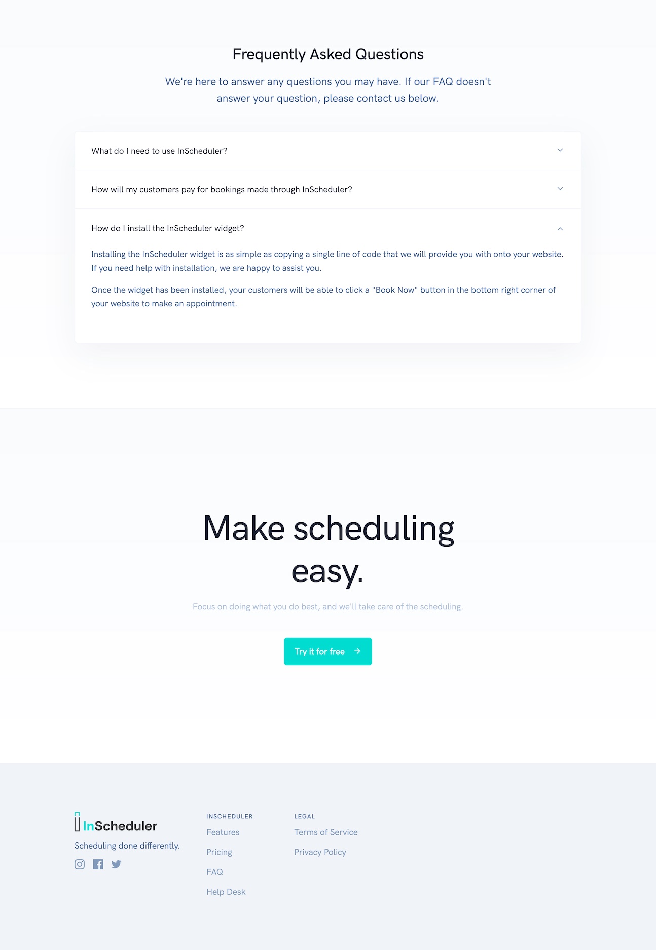
When we scroll, there’s an FAQ and a final call to sign up. Standard stuff. I wonder if that’ll be enough.
What Can Be Improved? Not so Fast on the Changes.
Already, we have an intuition about a few things that can be improved:
- Maybe answer a little earlier the questions about adding this to your website.
- Maybe address this idea that it’s a separate service from their current website builder software (e.g. Squarespace), and that it’ll play well with it.
But this exercise is a little too generic. We’re assuming a typical visitor, and there is no such thing.
It hasn’t been explicit, but my above run-through was for someone who was passively looking for a solution.
The problem with my analysis? There was no chance that InScheduler as a solution would have been appealing to that passive visitor.
What we’re looking for are visitors that have experienced an “enough is enough” moment. We’re looking for struggling visitors.
Finding Struggles: “Enough is Enough” Moments
We haven’t yet colored our understanding of the visitor at a level that lets us predict whether they’ll buy or not. For that, we need to go a level deeper. We need to understand the situations that are ripe for a switch.
We’re looking for the context that creates an “enough is enough” moment, and then simulate how visitors will experience the site.
The next article in the series will be about that. We’ll look for those “enough is enough” moments. More specifically, we’ll be crafting when statements. And then we’ll be able to craft a site that helps those people make progress on their struggle.
Hold tight! It’ll be a fun ride, because I think InScheduler (the website and the product) has some untapped potential.
Stay Sharp.
—
Pascal Laliberté
@pascallaliberte
