No-code Site Builders for Making Struggle-First Landing Pages
We’re fans here of creating landing pages that have a lot of text, that start off by mirroring to the visitor the struggle they’re going through, and that use nice styling to make the page easy to scan, scroll, and read.
I call this type of landing page struggle-first pages.
Let’s see if we can reproduce one of my own struggle-first pages using the following no-code site builders. (We can.)
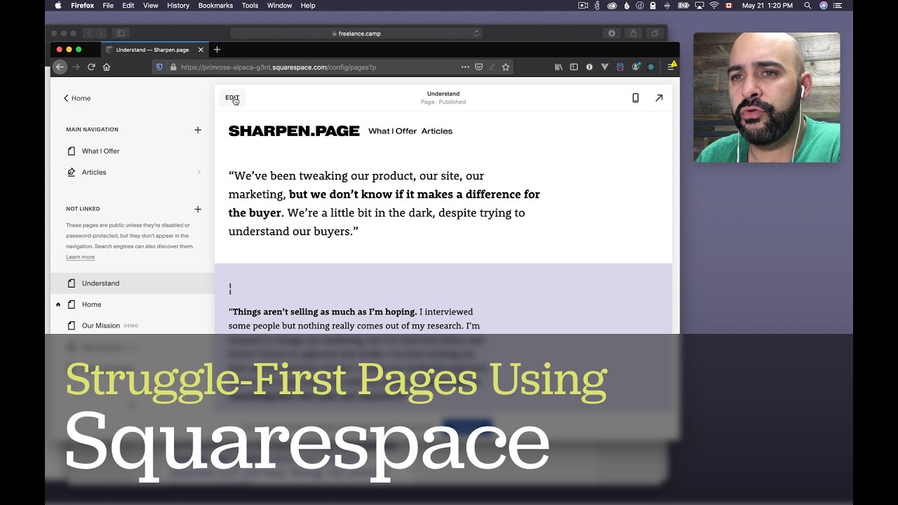
- Squarespace (pretty good)
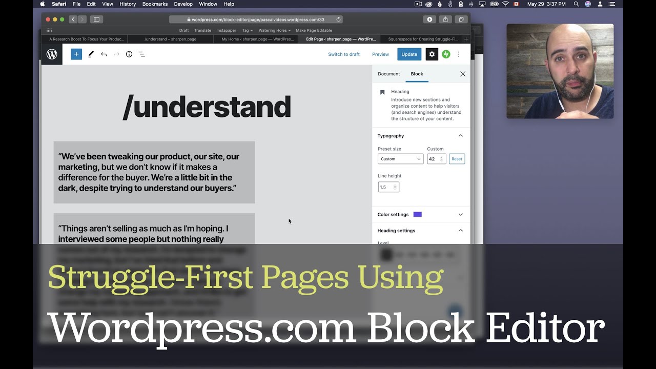
- WordPress using the Block Editor (surprisingly good)
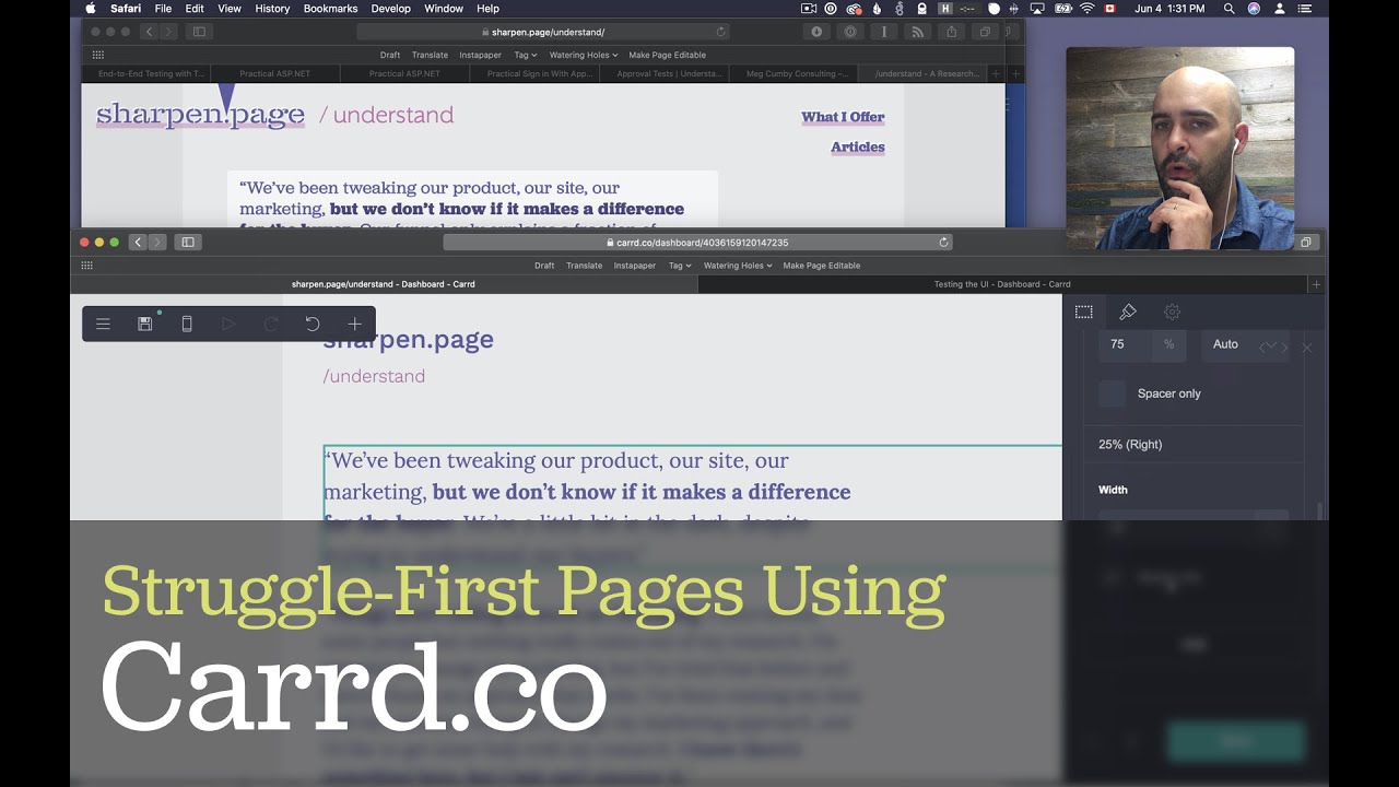
- Carrd (my favorite so far)
The Page We’ll Be Reproducing And What I Was Looking For
The page I wanted to reproduce was the one for my old /understand service offering.
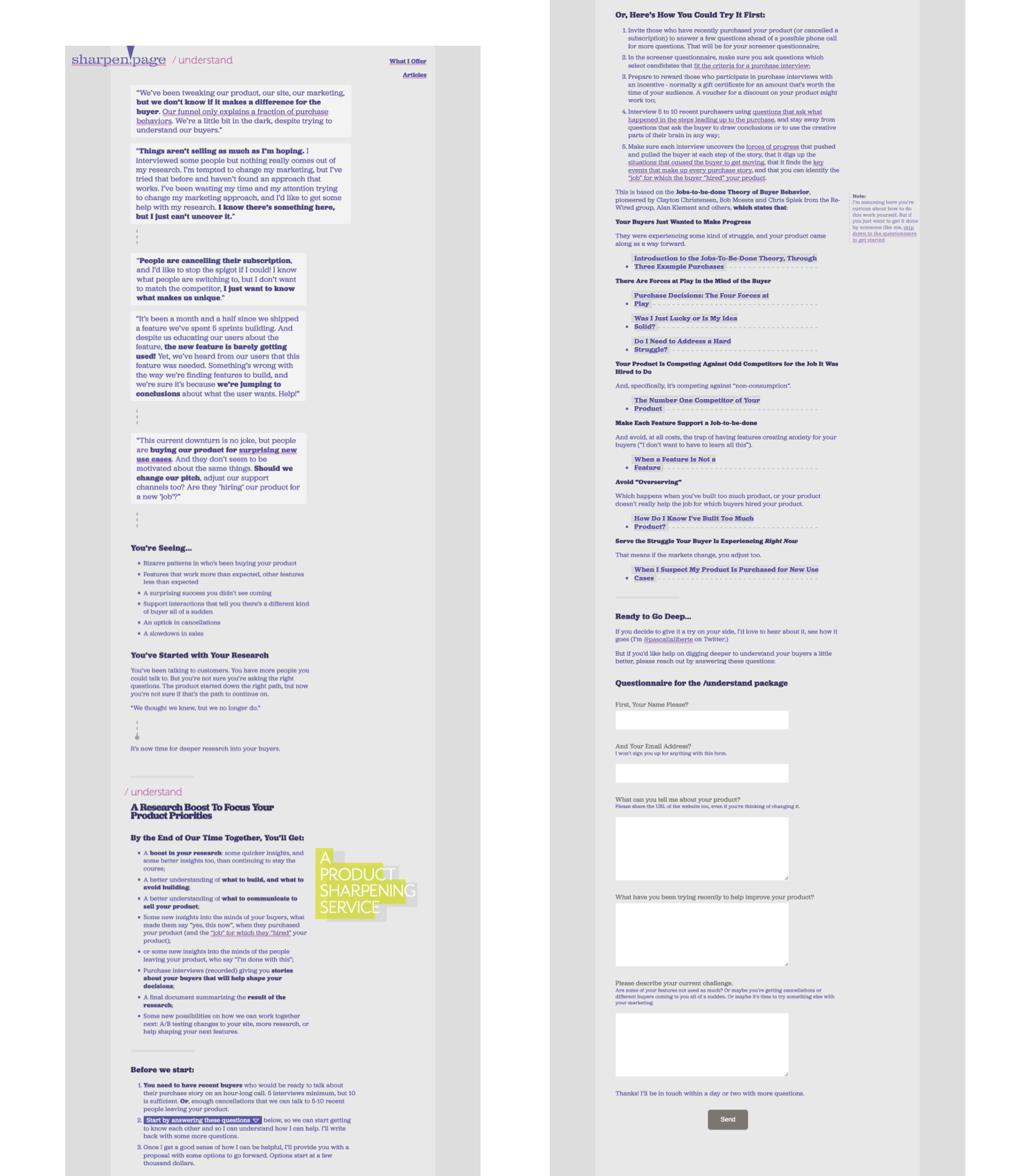
Most no-code site builders are good at making typical three column layouts, a big hero at the top, fixed-width text, image+text sections.
But can they do the following?
- Allow having text blocks with different widths, but overall always being left justified so the eye always scans the left side of the screen;
- Allow differently-sized headings, where the heading size is not bound to the h1/h2/h3 hierarchy (e.g. have a h2 that’s larger than normal to create contextual contrast), and allow differently-sized paragraph text, also to create contextual contrast;
- Bonus: match the same visual styling as the existing page.
Videos to See Each Tool In Detail
Overall all three tools did okay.
Squarespace made it easy to change the width of text blocks. The page didn’t end up having the same style, but in a pinch, I thought it made for a nice tool to work with and nicely-thought-out constraints to balance simplicity and flexibility. One constraint that wasn’t too great: to change the size of a heading, you need to change to another heading level (e.g. h2 instead of h3).
WordPress using the Block Editor was surprisingly good. The Block Editor allowed me to have text that’s in boxes of different widths, plus I could easily change the size of a heading without changing to another heading level. I couldn’t match the styling as much, however.
Carrd was my favorite tool so far. I could reproduce the layout, have different widths for different text blocks, I could change the text size at will, plus, I could achieve a very close styling. One important note: Carrd is for one-page websites. Overall, though, I was impressed with Carrd.
So overall I was pretty impressed with these no-code tools. Hope you give a struggle-first layout a shot for your next landing page.
Stay sharp.
—
Pascal Laliberté
@pascallaliberte