Four Ways to Tell Your Visitors 'There's a Better Way'
You’ve found ways to communicate to your visitor that you understand their hard struggle. You start off your landing page with a minimum of evidence to demonstrate that you do so that your visitor can quickly say “I feel seen!”
So, now what? On your landing page, what should come right after the struggle? Jump straight to your solution? “I understand your problem, now here’s my service, here’s my product”.
You could jump straight from problem to solution. But maybe you’d want to add a section in between those two.
We recently saw the Pain-Dream-Fix layout, and how it jives well with the theory of Jobs-To-Be-Done. It proposed three main sections: in between the Pain and the Fix, there’s an important section: the Dream.
Imagine your visitor feeling understood, and right away being presented with a product, with a service.
Instead, imagine your visitor being in that state of feeling understood, and you instead lay out a new hypothetical situation where the problem no longer exists. The visitor now feels even more understood and feels like her situation is not a one-off. “There’s an official way out of this mess.”
Here are four ways taken from the wild which show a way forward without talking about the solution per se.
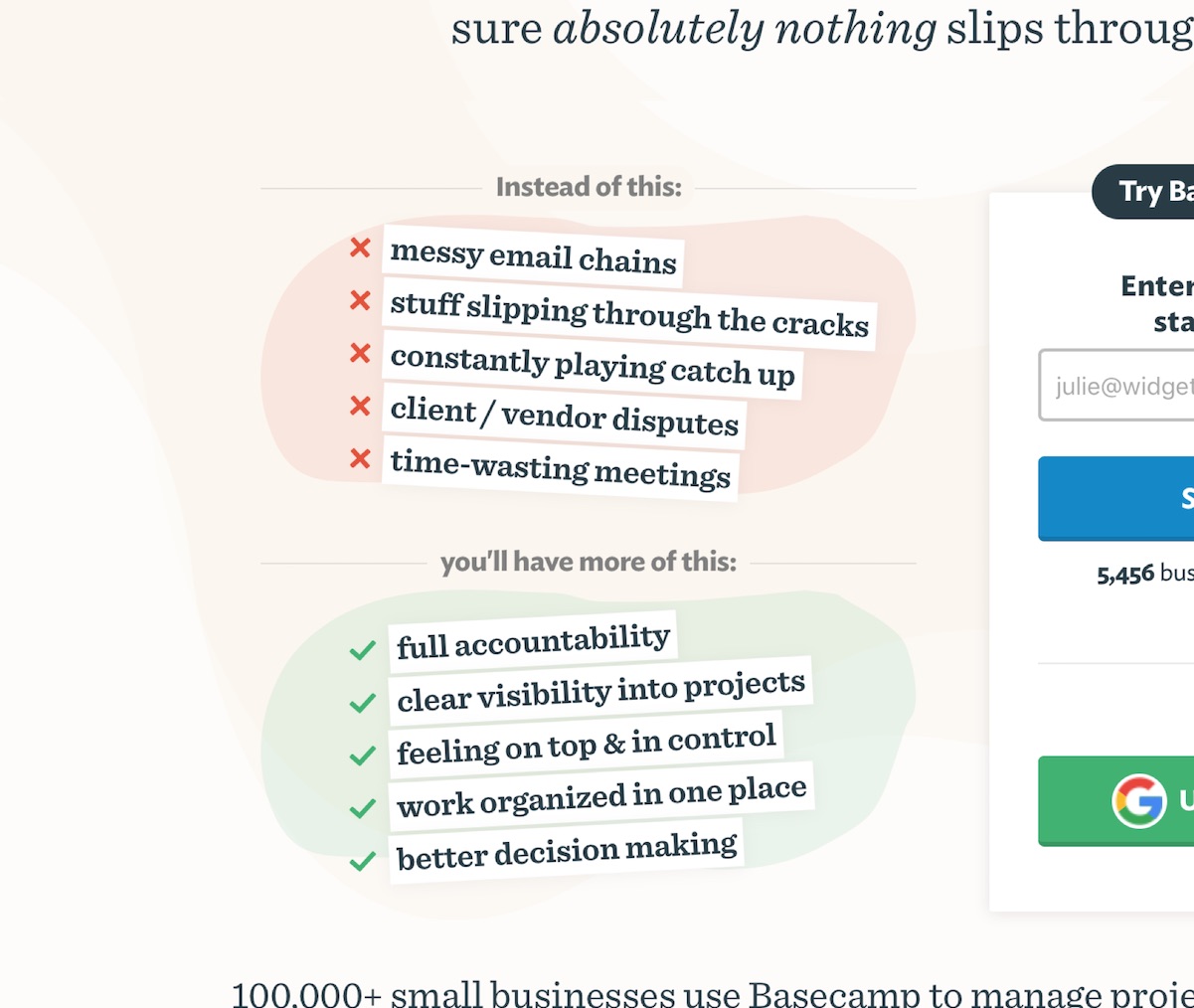
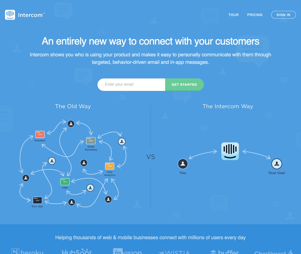
1. The “Instead of/You’ll have” and “Before and After” Patterns
This is a classic visual technique. It juxtaposes the struggling situation besides a future, better situation. This creates contrast, and is effective at making your point.
Here we see old versions of basecamp.com and intercom.io using the technique to great effect:
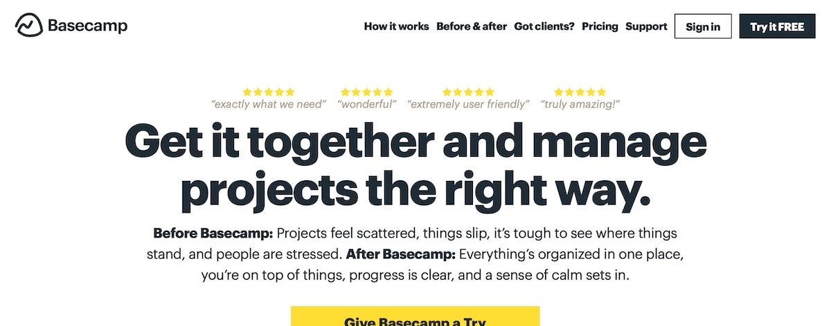
And here’s an example of “Before and After” using just text, from the current basecamp.com home page.
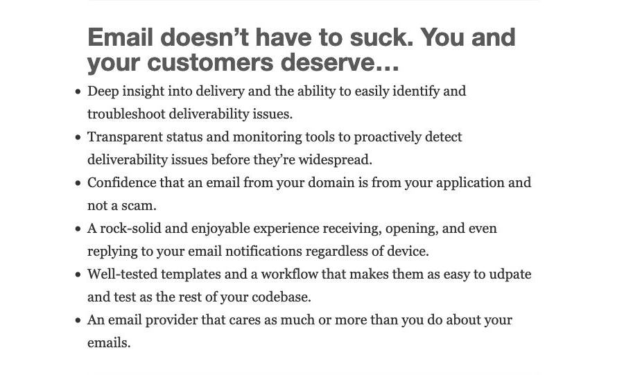
2. “Deserve”
A few articles ago, we looked at the landing page of applicationemail.com from Garrett Dimon.
Here, Garrett uses the “Deserve” word to transport the visitor to a new possibility:
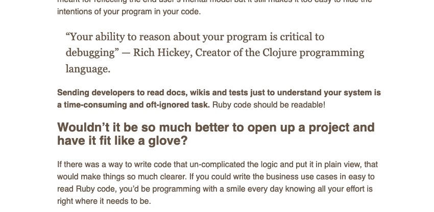
3. “Wouldn’t It Be Much Better If…”
In the article An Example Of An Unconventional Landing Page, we saw how the Struggle-First page layout works well to sell an ebook.
Nestled into the copy, we see this dream pattern in the form of “Wouldn’t it be much better if?”
4. “What If?”
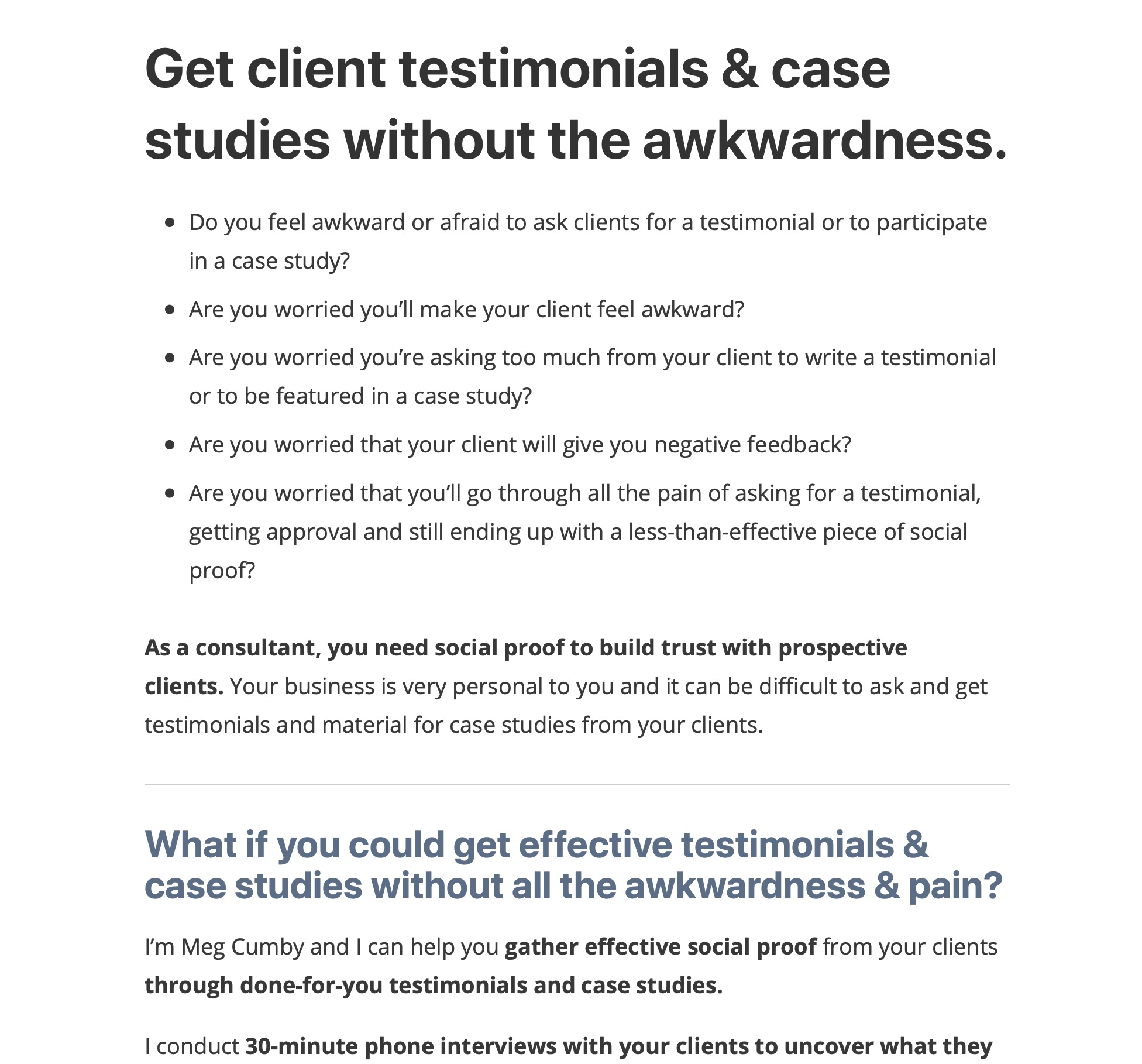
And lastly, here’s an example from Meg Cumby’s service offering page.
Meg offers the service of interviewing your past clients to write testimonials for your consulting business (pretty neat!)
After showing she understands the struggle of how awkward it is to ask past clients for testimonials, she shows a way forward by using “What if?”.
The Dream on her page fits succintly in a single headline:
A few more…
All of these are great ways to establish that your product, that your service, has the means to achieve the outcome your visitor’s after. It says: “I can help you make the progress you want to be making”.
These approaches take the visitor out of their day-to-day, and transports them where it no longer hurts.
When falling on these bits of text, they can connect the dots between “this, now” and “over there, soon”.
Want a few more ways to write the Dream?
- “Imagine if”
- “Let’s Pretend We’re in the Future”
- “It Doesn’t Have to Be This Way”
- “Here’s a Different Scenario”
Or, simply:
- “There’s a Better Way”
Stay Sharp!
—
Pascal Laliberté
@pascallaliberte