A Bunch of Example Landing Pages With (Mostly) Just Text
In this thread, the following question pops-up (emphasis mine):
I have been trying to build a landing page for a while. I don’t want to use stock photos or those overused illustrations that don’t really convey anything. However, eliminating these two choices leaves me with an all-text page. How should I approach this? Should I draw some basic images myself? Should I give up and go the generic route?
Wordy, Mostly-Text Pages are Fine
A couple articles ago, I wrote about why it’s okay to have a page with mostly just text.
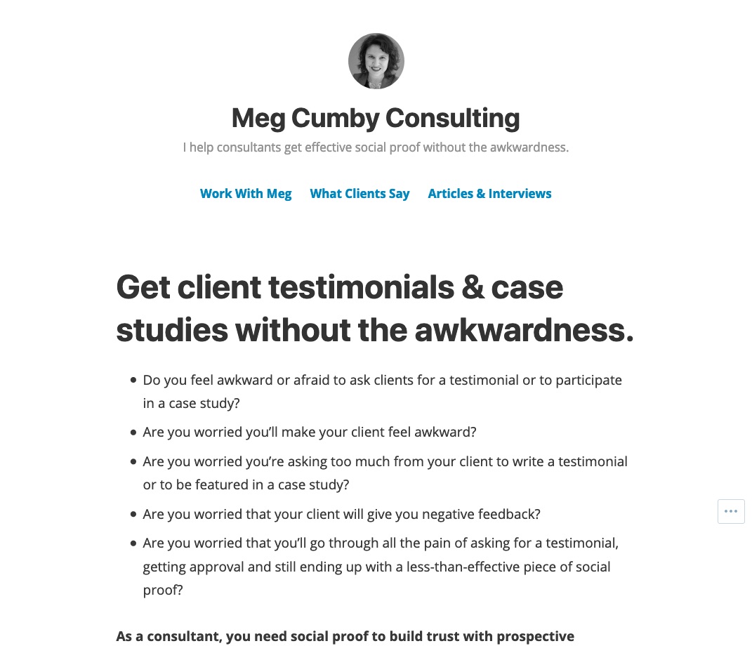
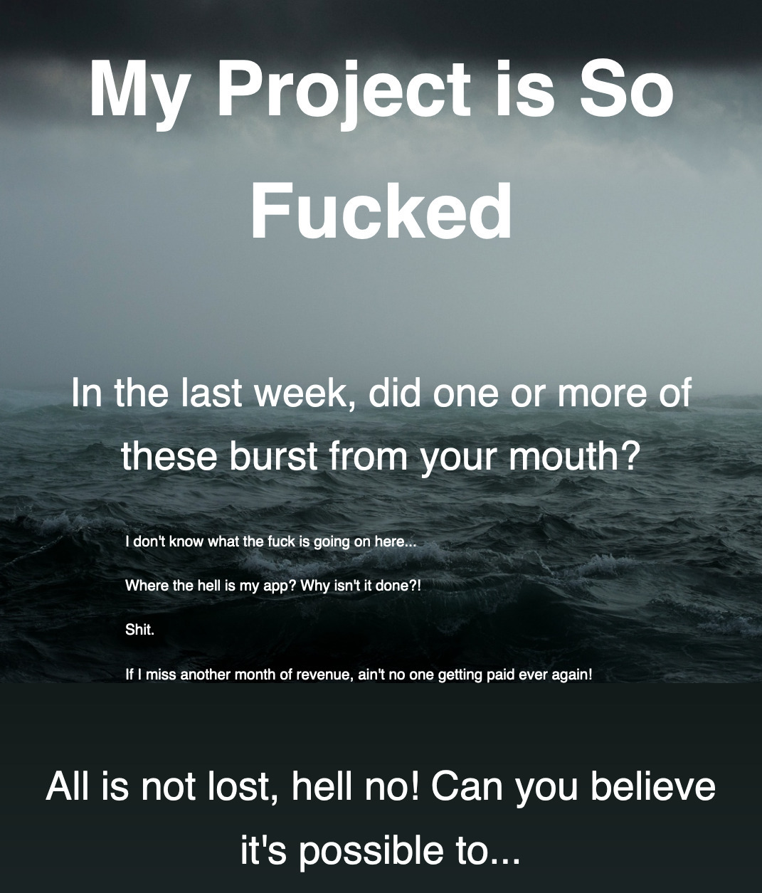
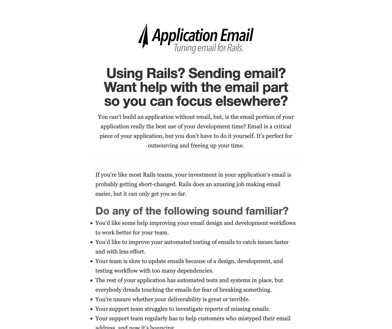
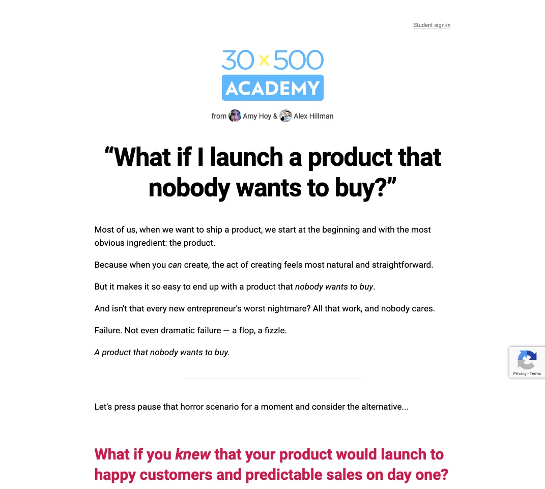
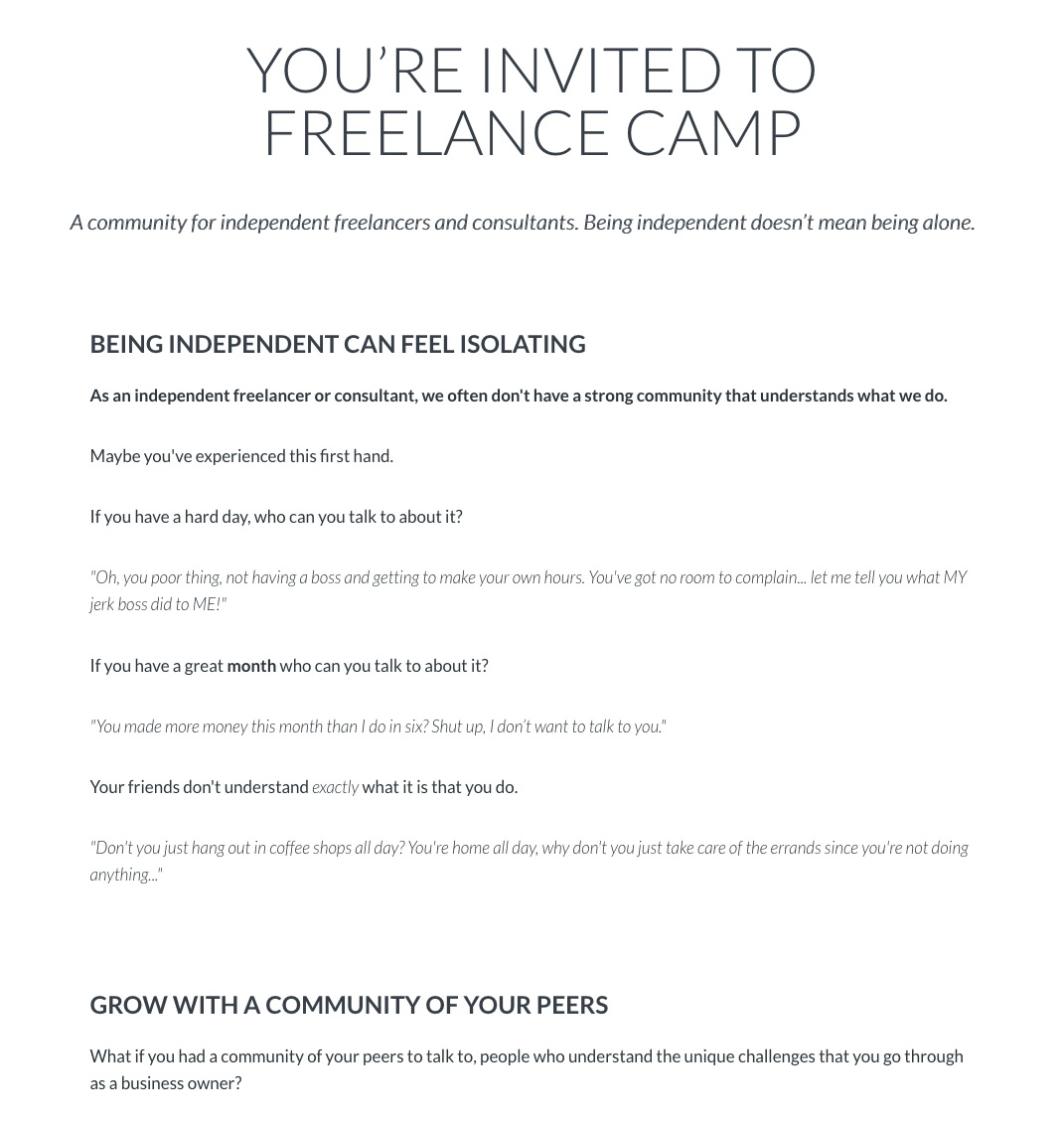
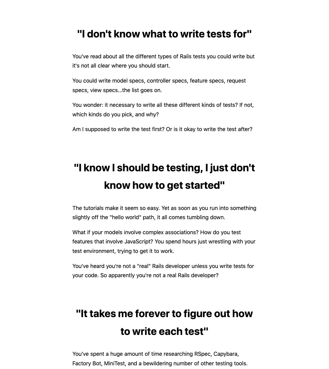
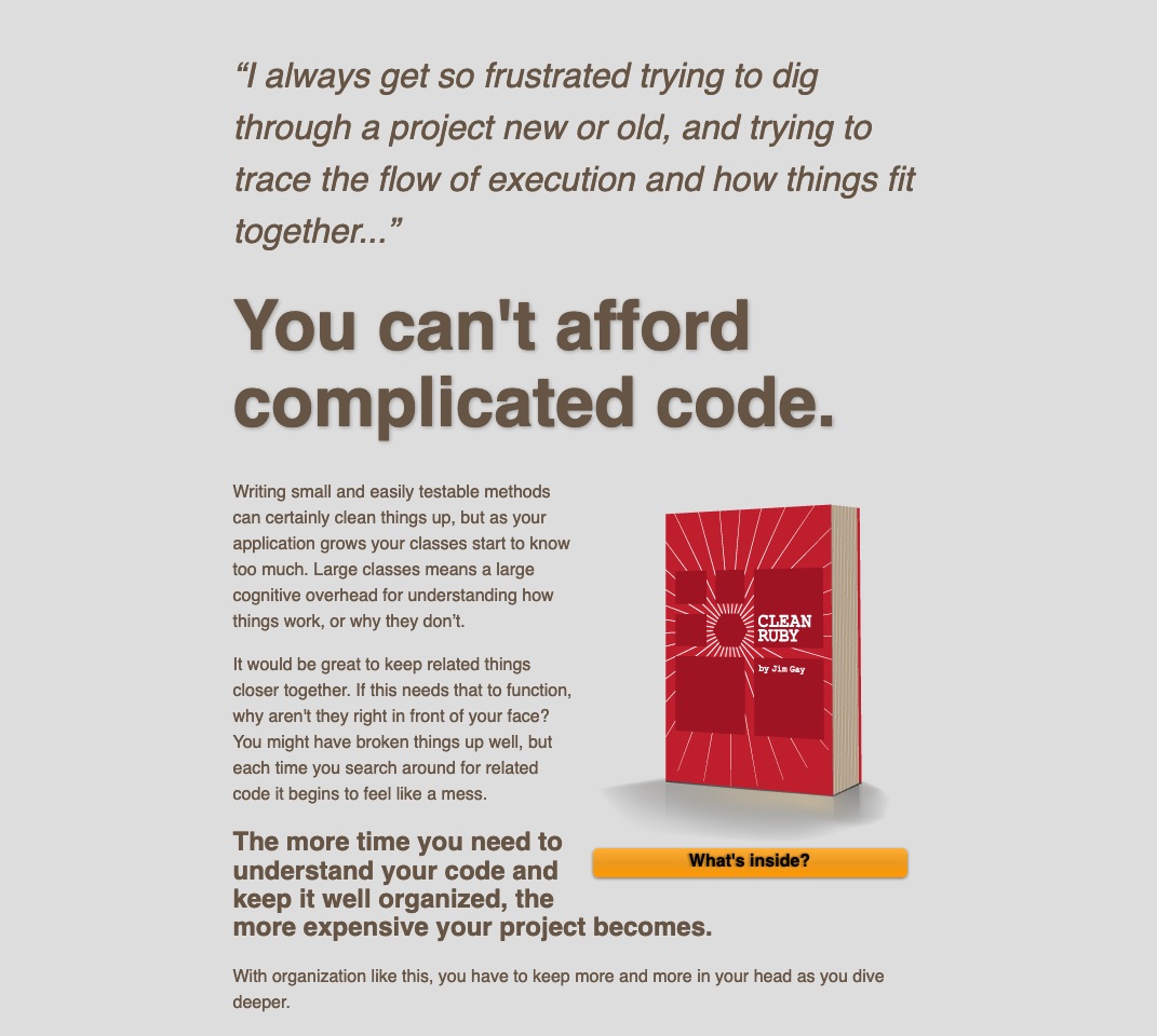
And so, to show what I mean, here are more examples of wordy pages.
Services
https://fixmyfuckingproject.com/
https://applicationemail.com/ (I wrote a more in-depth review of this site right here)
Communities/Courses
Books
https://www.codewithjason.com/rails-testing-for-beginners/
http://www.clean-ruby.com/ (I wrote about this one too right here)
These are also great examples of Struggle-First pages. See how the pages start by telling the visitor how much they understand what they’re going through? If the thing your building respond to a real struggle, be confident about ditching those unecessary pictures, and go with a wordy page.
People come to your page to make progress, so help them do that.
Stay Sharp!
—
Pascal Laliberté
@pascallaliberte
