Rewrite for InScheduler - Part 4: Tweaking the Appeal
Last time, we saw how InScheduler.com created questions it didn’t answer, even for its best buyers.
In this article, we’ll propose a first set of changes to the page, concentrating on fixing the description of the product for its best buyers. Next article, we’ll go further into pricing and the buyer’s next steps.
The Best Buyers Are In This Situation
Recap from Part 2: the best buyers are those who are experiencing a hard struggle, and where their “I’ll just” alternatives just won’t do. This is the struggling situation that we identified:
When we’re getting a lot of new clients from the website, but a lot of no-shows too
I want to find a way to get these strangers to commit
So I can focus on the clients present in the shop, and not be worrying about no-shows.
It’s a dual situation: these hair salon/barbershop/spa owners are getting steady business from their websites, but they’re getting no-shows too. In this context, InScheduler is interesting. “Give me a way to book people, I’ll get my no-shows taken care of.”
That situation will bring them to the page with eagerness. But as we’ve seen in Part 3, when experiencing the page, they’ll have questions.
The Buyer Will Have Questions
In this spot, they’ll know that InScheduler adds a widget to the page. But they’ll have these questions pop up:
Will this work on my site?
Do I have to be the one to install this thing on my site? I don’t know how.
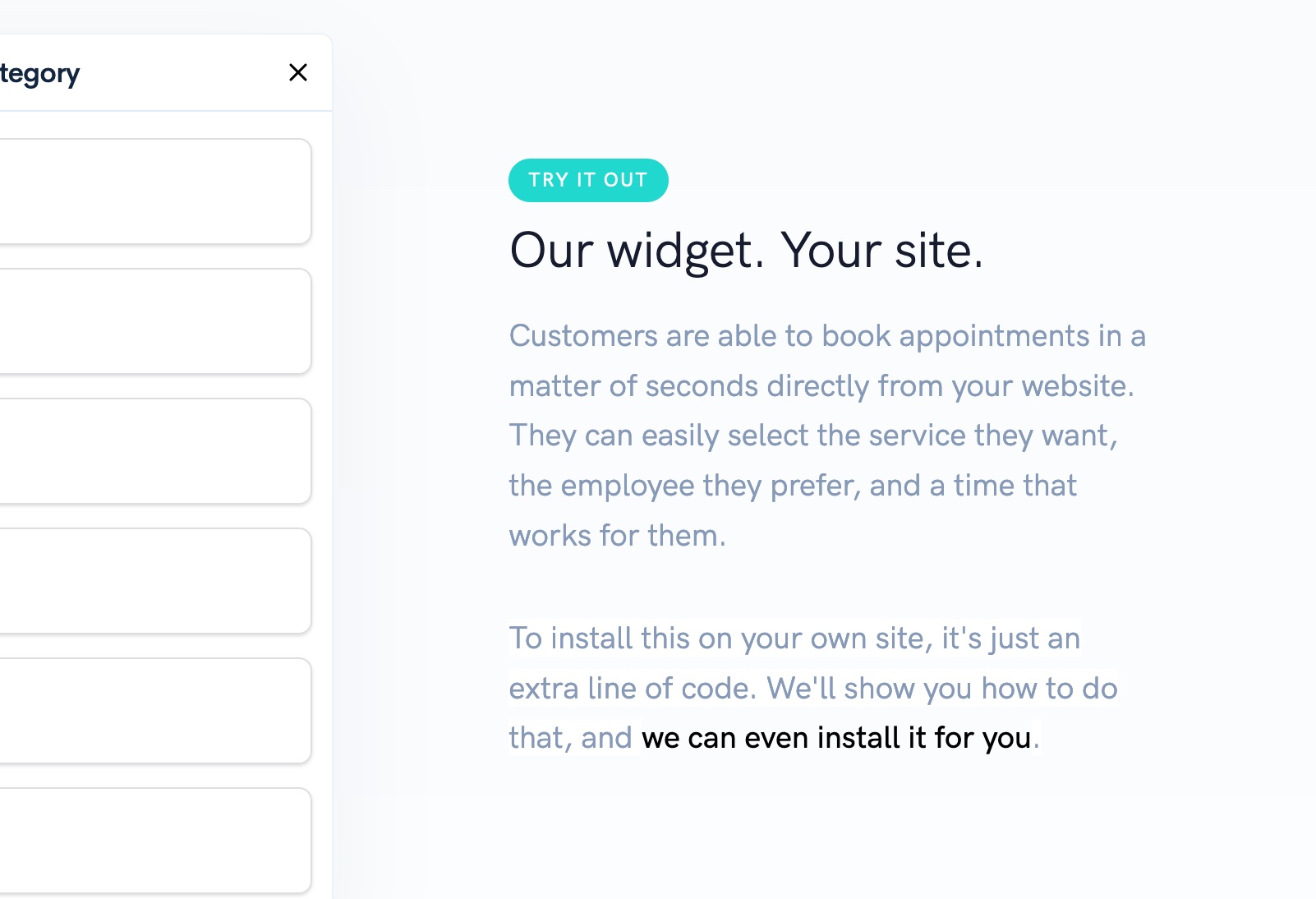
So it would be a real service to our visitors to answer those questions right there:
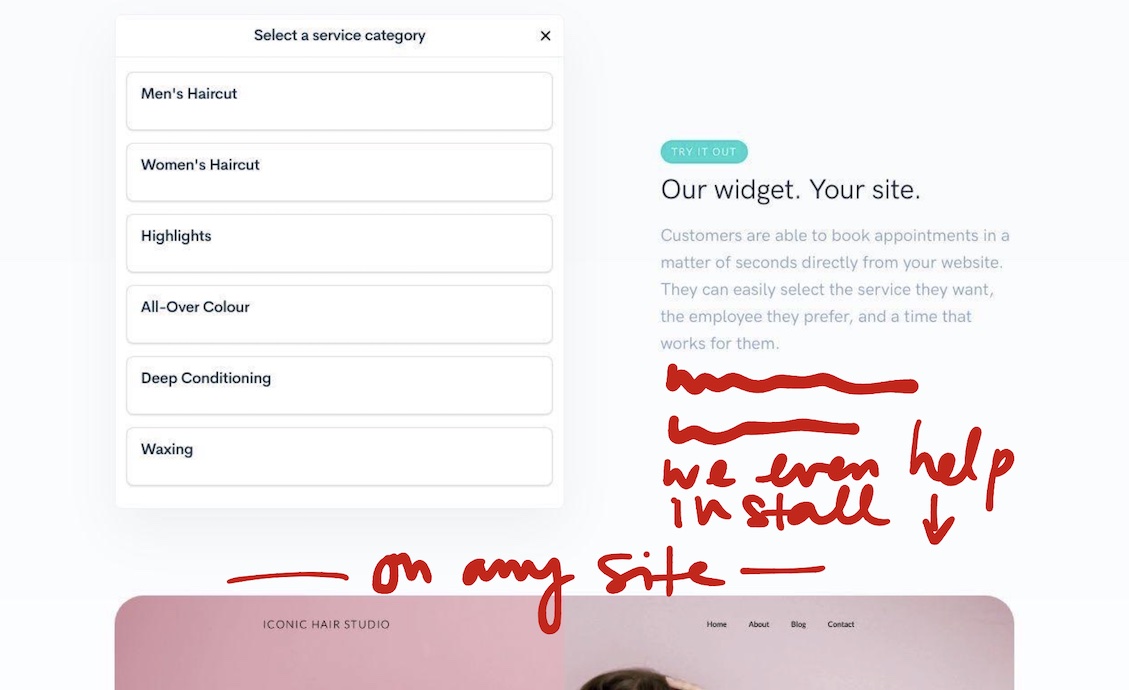
Right below the paragraph for “Our Widget, Your Site”, let’s add another paragraph to re-assure.
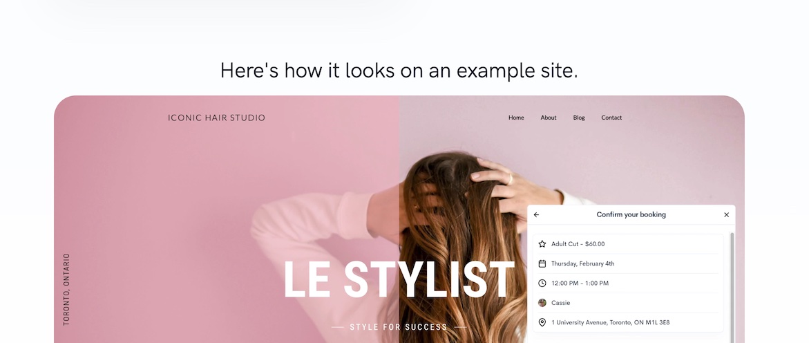
And then just above the example site, a heading to help the visitor understand how the widget fits in.
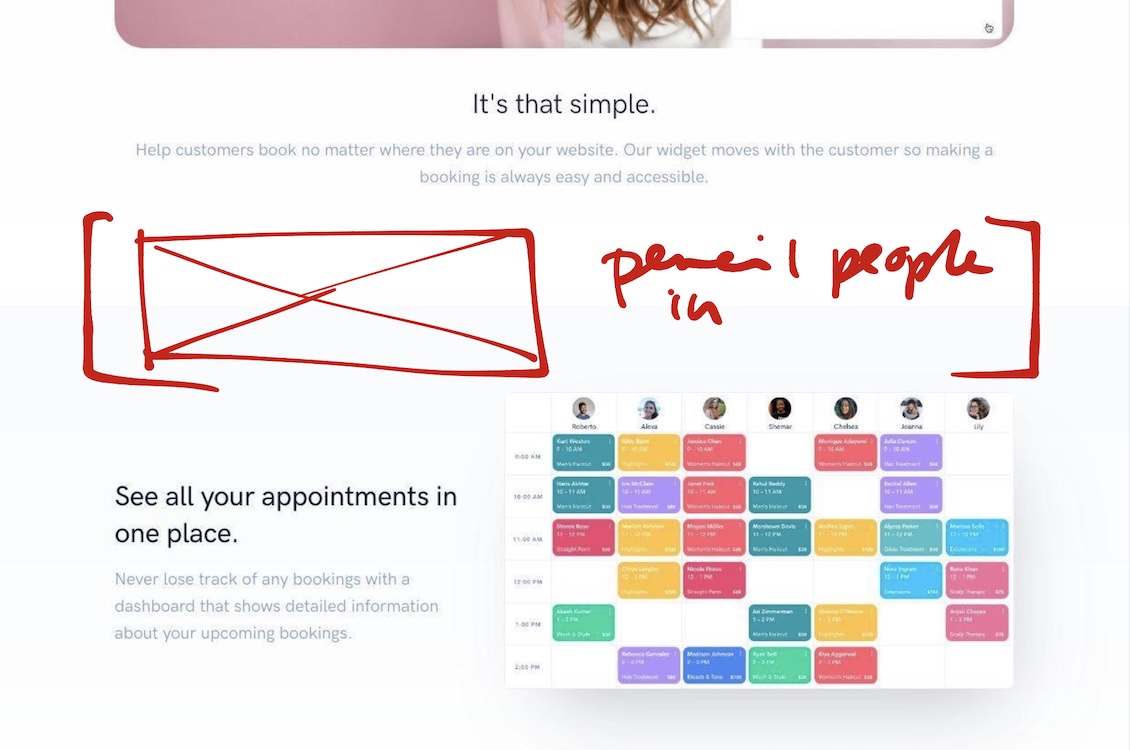
The Missing Product Screenshots
Just below the example website, we enter the part of the page that shows the product with screenshots.
There’s a couple screenshots missing.
At this point in the page, when the visitor will see the back-end, the calendar that they will see, they’ll be worried about a couple things.
What about the people who usually call in? Can I pencil them in quickly?
So that’s one screenshot that’s missing.
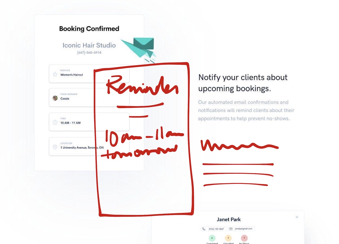
And then further below, we see the image of the email the client will be getting. But then the question comes up:
But is that going to be enough to reduce no-shows?
So let’s add a screenshot of the reminder email (assuming there is one).
These Changes Will Reduce Anxieties, Adding Appeal
To add appeal, you’re usually better off reducing anxieties. For the buyers of InScheduler, the anxieties revolve around pulling this tool into their existing business. Sure, a salon that’s opening up might consider installing InScheduler, “hire” the tool as the official scheduling assistant of sorts. But even for owners opening up a new salon, having a site that is clearer about those extra details will reduce anxieties.
The big remaining anxiety to fix: pricing and the interested buyer’s next steps.
We can do something about that, and let’s tackle that next time.
Stay Sharp!
—
Pascal Laliberté
@pascallaliberte