Visitors Will Excuse Your Un-styled Landing Page
But they won’t excuse your lack of empathy for their struggle.
You’ve been fussing over your product’s marketing page for too long. “Am I using the right font?” “Is the design good enough?” “Does my site look professional enough?”
And then you launch your site, ask for feedback on IndieHackers or r/design_critiques, and you get feedback like this:
Try to pick a font that looks more professional.
Line up everything nicely. Here’s a three column template I recommend using.
Move that button over, make it more visible.
Too much text.
That’s the wrong feedback. That feedback will lead you to have a site that’s safe. It won’t lead you to have a site that works.
(By the way: no, you probably don’t have too much text.)
This beauty of a site, on the other hand, worked.
Edit: productlistings.app was since taken offline. What follows is from the version of the page I reviewed.
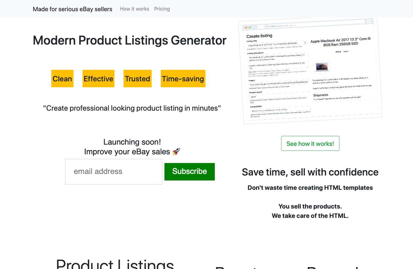
It was unstyled. It was wordy. Stuff wasn’t aligned that well. It used the default browser font. The picture was small.
But who cares?
We’re looking at the site with the wrong eyes, with the wrong brain mode.
The visitor’s brain mode? Well it’s about solving a struggle.
Will the Visitor Scroll for More?
Here’s the situation the visitor was in before arriving on the site:
“When” Statement:
When I’m comparing my text-based eBay listing to other listings made with custom html, I want to find a way to make html listings on eBay like the pros so I can make my listing seem more legitimate and trustworthy and ensure I get a good price.
Then the visitor would type something like “html eBay product listing” into Google, find a page like this, and experience the following forces in their mind as they experience the page:
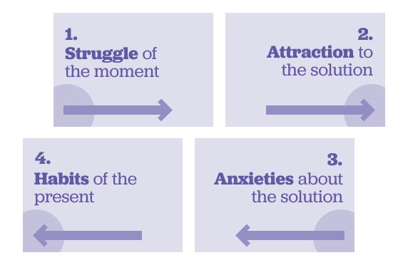
- ⚬→ Struggle: I’m comparing my text-based eBay listing to other listings made with custom html, and mine isn’t as rich.
- →⚬ Attraction: I’ll be able to put in my text, and get an HTML-formatted preview I can use on eBay.
- →⚬ Attraction: I’ll be able to choose from templates.
“Sure, let’s see how it works.” The forces check out. No anxieties (despite the unstyled look!). The visitor scrolls. That right there, is why this page worked.
What About the Look?
Despite the unstyled look, the site did create trust. There was something familiar and honest about the words and the choices.
For example, look at those adjectives in the yellow boxes (“Clean Effective Trusted Time-saving”), and look at the quotation marks around “Create professional looking product listings in minutes”.
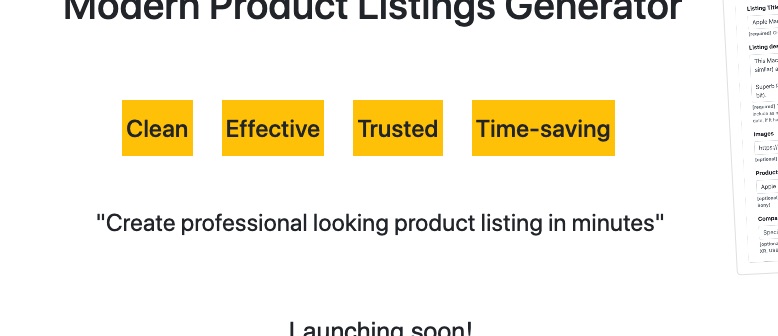
Most designers would balk at that styling, but those elements had the style of a familiar neighborhood handyman advertisement. Nothing fancy. Straight-talking. Midwestern-style no-nonsense.
But Will They Buy (Sign up to Get Notified)?
Let’s see how the forces checked out as the visitor scrolled.
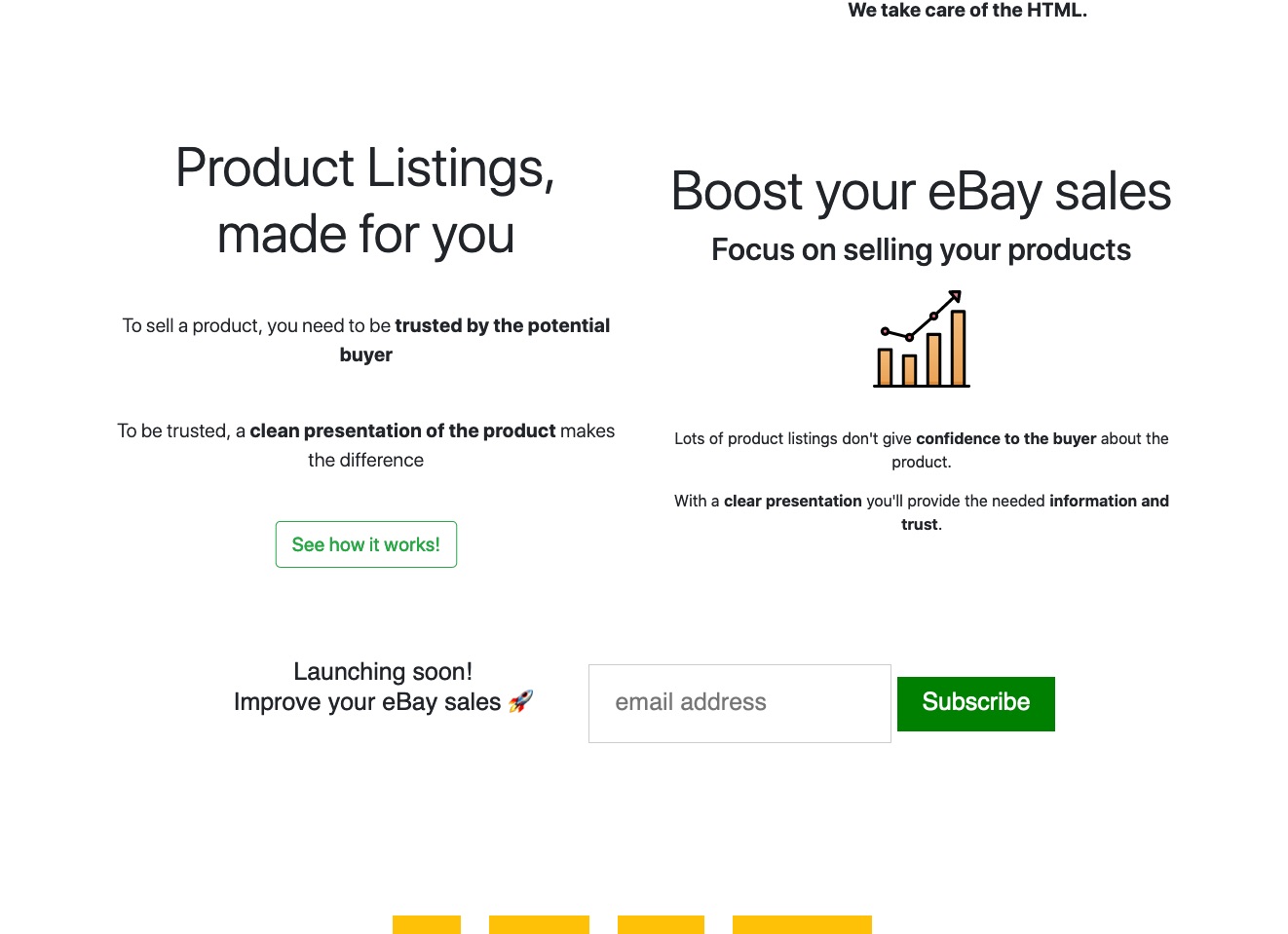
- →⚬ Attraction: Yep, that’s why I’m here. This is me.
No anxieties so far. Gimme Gimme Gimme. Scroll.
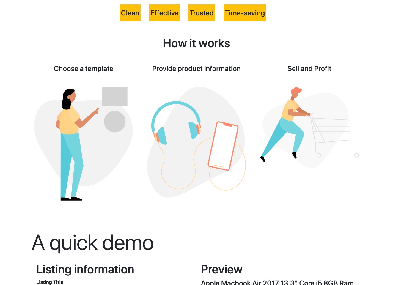
Sure. Oh good, there’s a demo, Scroll.
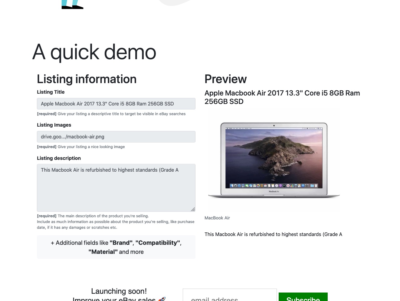
- →⚬ Attraction: This looks nice. I’ll be able to put some additional fields too.
No anxieties so far. Launching soon huh? Scroll.
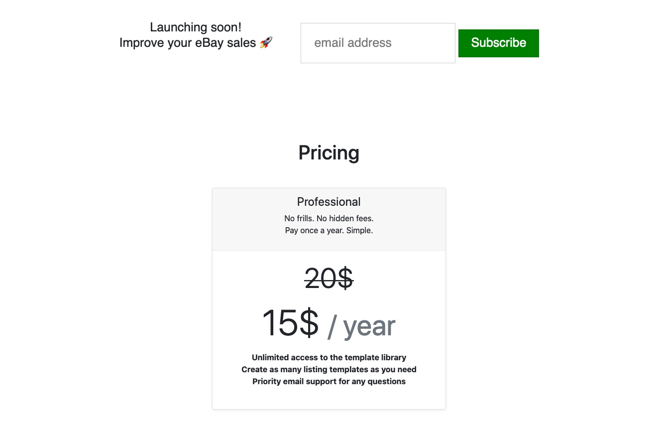
Normally a price contributes to anxieties. But here, it was neither too high nor too low.
- →⚬ Attraction: Nice, I’m sure I’ll be able to put 4 or 5 things to sell on eBay in the next year for sure.
- ←⚬ Anxiety: But I need this tool now.
- ⚬← Habits: I’ll just go to another site to try to figure it out for this one time. I might come back later.
- ⚬→ Struggle: But losing my time means losing money.
See how the fact that this tool wasn’t yet available was causing the first anxiety on the whole page? To fix that, I’d have added a note, just below the sign-up box, offering to help the person in the next 24 hours if they signed up. For the first one, you’d actually make their HTML for them.
With a small tweak like that, I think that would have taken care of the only real anxiety putting the brakes on signing up to be notified.
So there we have it. A page that worked. Not despite its unstyled look, a little bit because of it, but mostly because it served the visitor’s struggles quite well.
Visitors will excuse your unstyled look. But they’ll leave if you don’t tend to their problem. Your visitor just wants to make progress.
Stay Sharp!
—