Rewrite for InScheduler - Part 3: Testing the Site Against the Best Buyer Situation
In the previous article, we came up with the situation that was most likely to cause a barbershop/hair salon/spa owner to say “enough is enough” and get moving to find a way to add online scheduling onto their website. Out of a list of seven such situations (like starting a new shop, opening up again fully post-pandemic, a change of ownership), there were only a couple situations that made the cut.
This is Part 3 of a series of articles on rewriting InScheduler.com, the website of an app that offers online scheduling for barbershops, hair salons and spas. In Part 1, we ran the site through a typical visitor, which won’t do. In Part 2, we identified the situations that are ripe for a visitor to “switch” to InScheduler.
We initially modelled the following situation, but the struggle wasn’t hard enough. Not enough momentum to clear the forces of progress, the mental back and forth in the mind of a visitor:
When no-shows are becoming a problem
I want to find a way to get our clients to commit
So I can stop thinking about no-shows and concentrate on our clients.
(This is a “when” statement. It includes the struggle the buyer wants to move away from, the next action, and the bigger aspiration that buyer wants progress on.)
As we saw in the previous article, this situation isn’t enough to get people to buy. The struggle isn’t that strong, and the “I’ll just” alternatives are too appealing. They’ll just tell clients to “please let us know if you need to cancel” when they’re on the phone with them.
But this situation presents enough of a struggle to make a visitor say “enough is enough”, and “yes, this, now”.
When we're getting a lot of new clients from the website, but a lot of no-shows too
I want to find a way to get these strangers to commit
So I can focus on the clients present in the shop, and not be worrying about no-shows.
Let’s test the site against this situation.
Site Run-Through: Upsurge in New Clients from the Web, Too Many No-shows
Let’s pretend we’re a visitor preoccupied with this struggle: no-shows are coupled with more brand-new clients from the website.
Our regulars will always be around. But the strangers finding us on the web (and it’s a majority now) seem to forget about their appointments for some reason. And it’s starting to become a problem. I started telling people to call ahead if they need to cancel, but I don’t want to have to tell this to everyone who calls.
How does the site do?
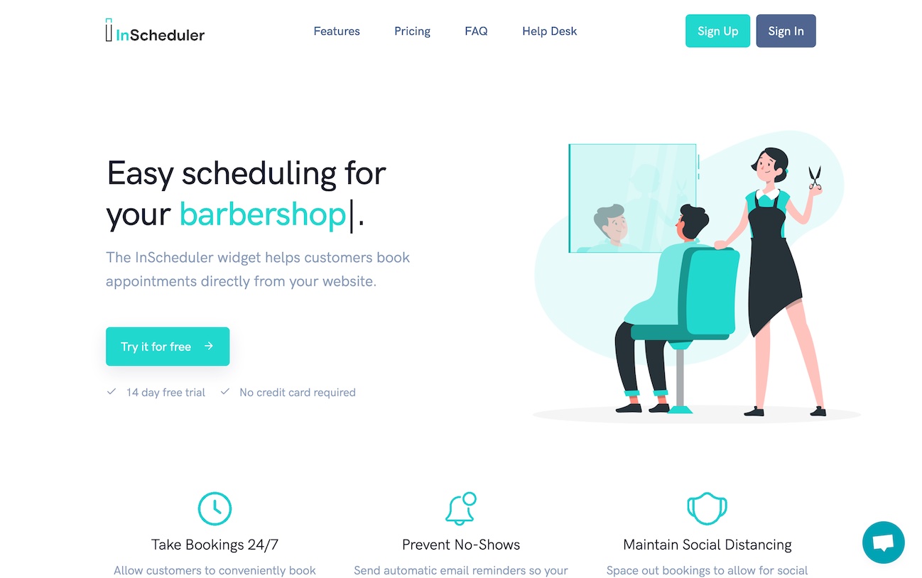
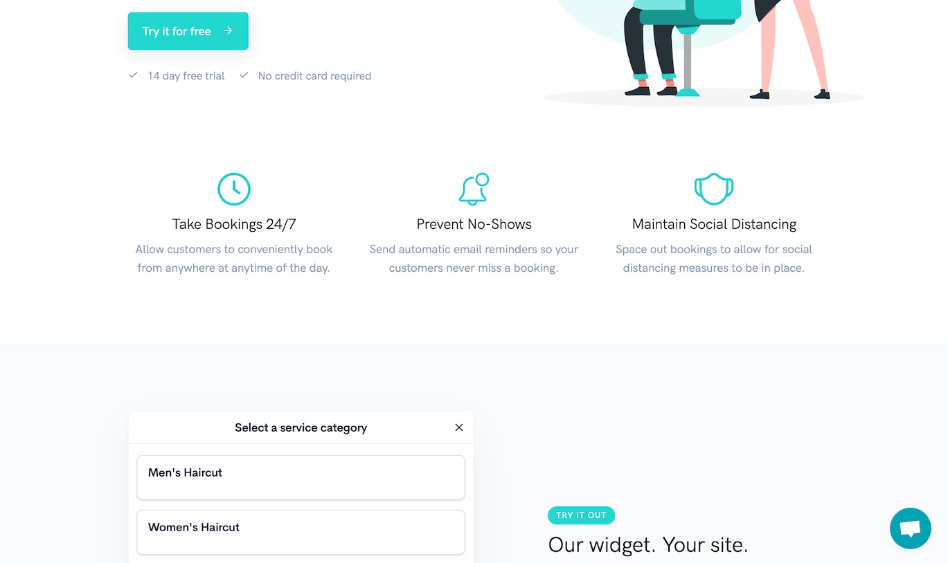
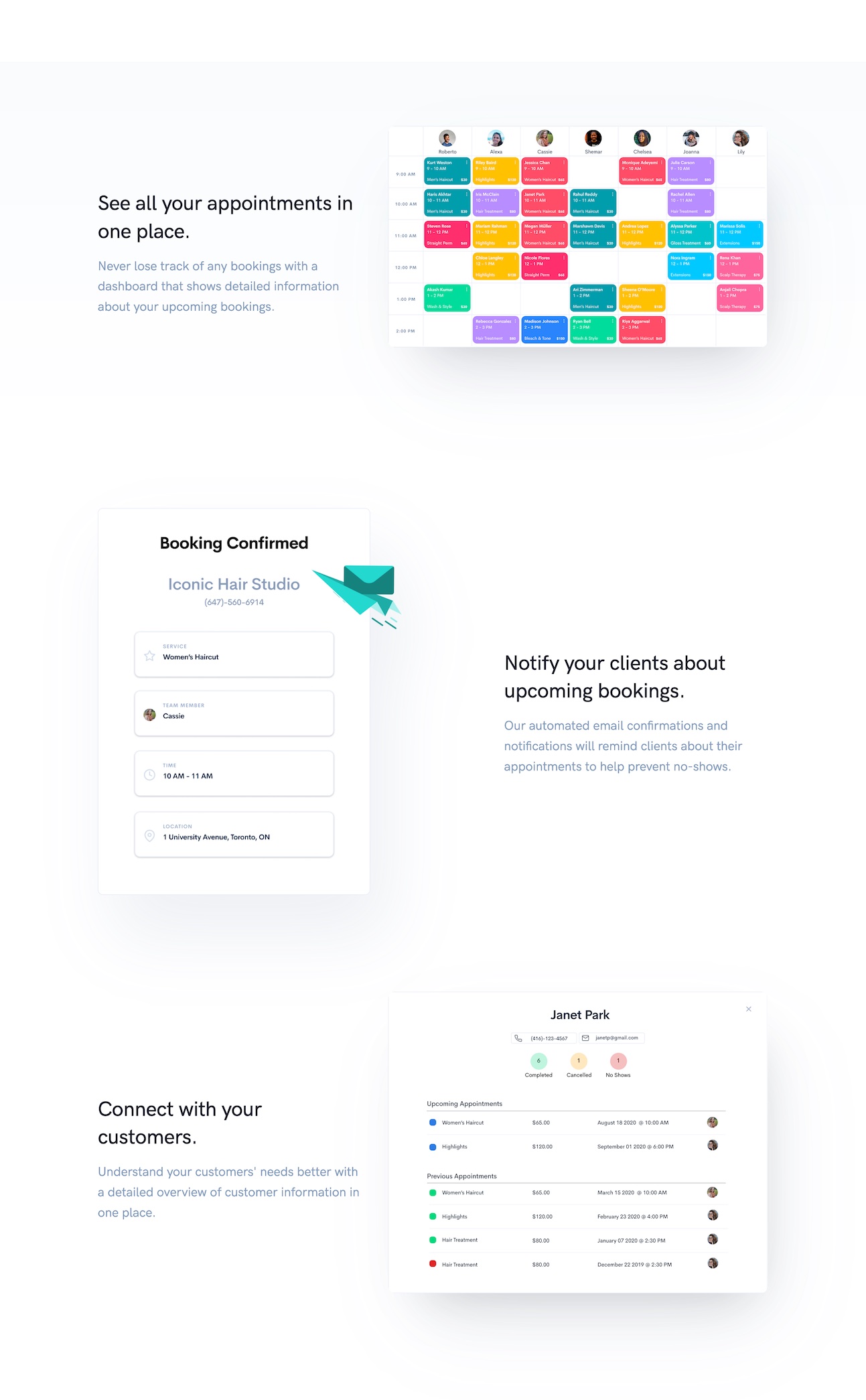
This looks nice. I see it prevents no-shows.
Attraction +1, Scrolls
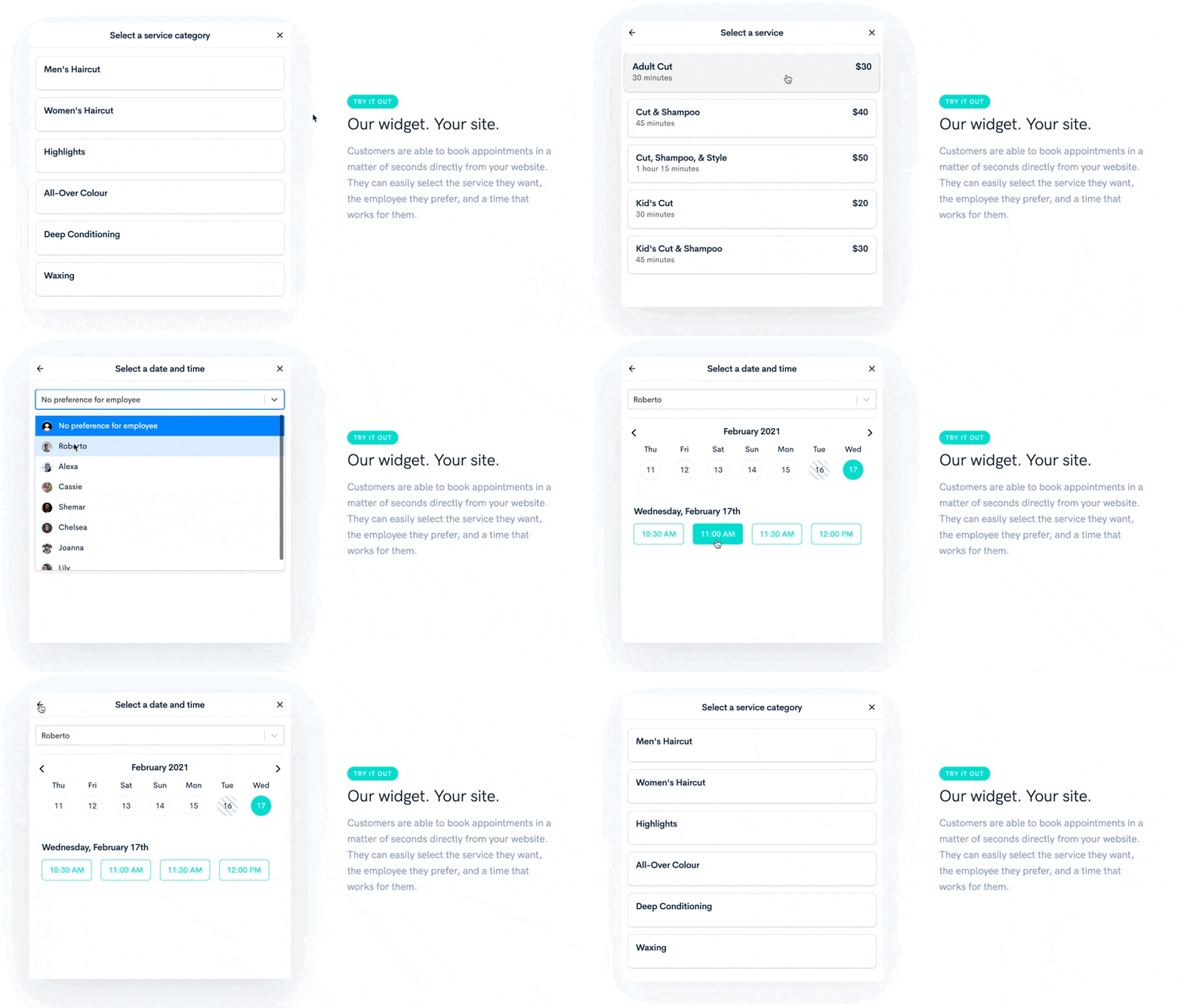
Oh good there’s a way to try out the experience of booking.
Attraction +1, Scrolls
That feels pretty good. Oops, better not go all the way to the end, I don’t want to be charged for just trying it out. Neat, you can select who you prefer scheduling with. Can I specify a no-preference? Ah yes.
Attraction +1
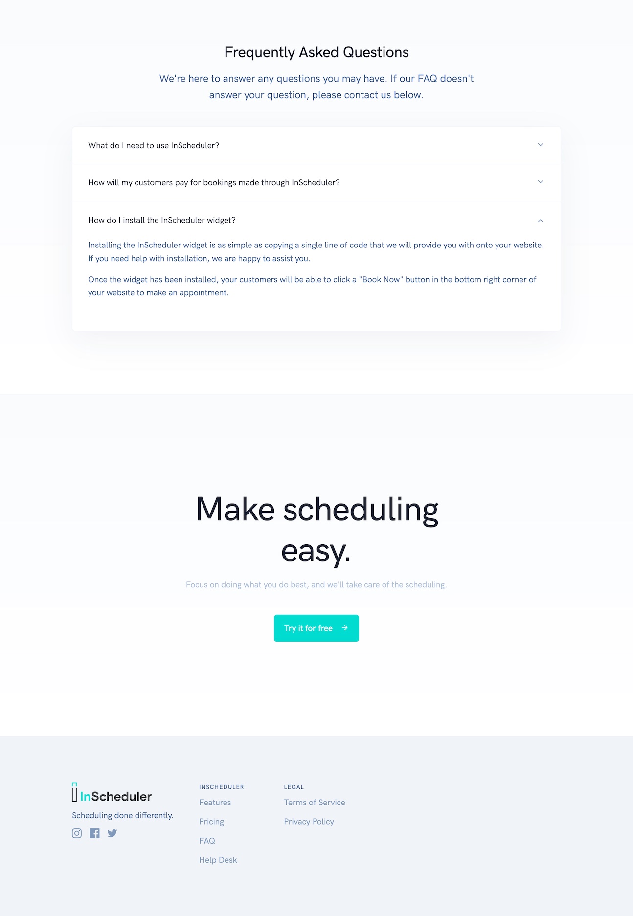
But is it hard to add this to my website? Can I install this thing on my website?
Anxieties +1
Will I have to ask all people who call in to go through my website? Can I pencil people in?
Anxieties +1, Scrolls with an eye for answers to those questions
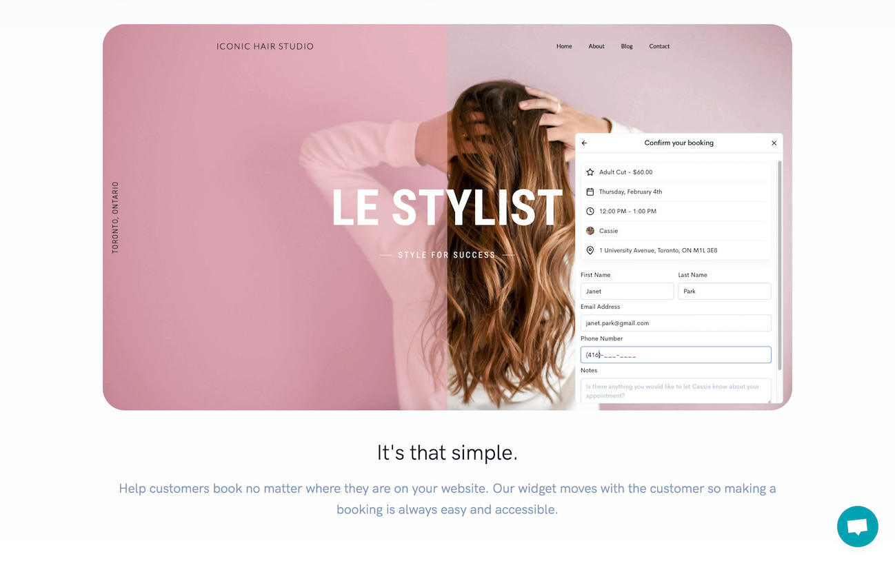
Ok, that’s nice, supposedly works on any site
Anxieties -1
Ok so that’s what I’ll see, what the client will get in the email. I must be able to manually add people. Hrmm, not sure. I guess I’ll have to give it a try to find out, but that seems like a lot of work. Maybe I’ll just wait a bit.
Habits +1. The visitor is on their way out a little bit, reverting to their “I’ll just” alternatives.
Here the visitor hesitates. It looks good, but they’re not going to just sign up. It looks like it’s a commitment and it’s too early to make the move.
Maybe I’m missing something, let me scroll the rest of the page real quick.
Scrolls
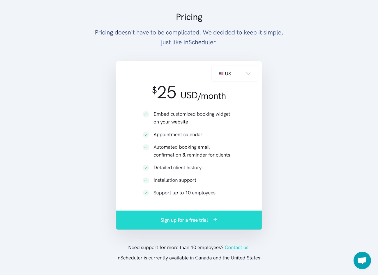
Ok so it’s not a free tool. So that’s $25 on top of what I currently pay for my site?
Bit of hesitation about the price, but mostly about the fact it’s a second bill.
Anxieties +1
Installation support. Oh good. Still nothing on whether I can manually schedule people who call in.
Scrolls
I don’t know, not right now. I might see if my current website builder tool has something like this built in.
Habits +1. Another “I’ll just”.
At this point, they’re leaving. But they’ll be back.
They’ll consider calling a nephew to see if there’s something cheaper. They’ll consider just adding a form. All the other alternatives won’t do the job-to-be-done as well, InScheduler will no-doubt be a good deal if you’re getting new clients from a website while having no-shows. They’ll be back.
The Next Step is Scary
That “Try it for free” is scary. It’s not just the Free Trial, it’s the bringing-this-tool-into-my-business that’s scary.
- “Do I have to install something on my site just to try it out?”
- “Do I have to manually re-import the appointments I have noted on pen and paper?”
- “Should I buy an iPad for the reception or is it going to be quick to use on my phone?”
- “How long is the trial for? Can I do everything with it?”
- “Changing to this means changing a big part of my business”
And the kicker, still yet unanswered:
- “Will I need to force my regulars to use the online widget, or can I add them in manually?”
Of course, I’m probably off with my assessment of some of the details of how scheduling works in salons and spas. And yet, there’s bound to be anxieties about the next steps that the site isn’t currently addressing.
Right now, the page isn’t a home-run, even if the struggling situation we identified is pretty solid. The page just doesn’t reduce enough anxieties, and there are important questions still unanswered. There are still some interesting things they can do around pricing which could help reduce some anxieties, and it’s not about lowering the monthly price.
So in the upcoming couple of articles, I’ll propose some changes to the site, in light of the above analysis. This is where the real rewrite will happen.
Stay Sharp!
—
Pascal Laliberté
@pascallaliberte
